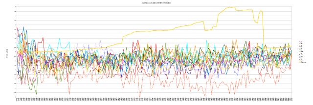
The Cumulative Monthly Anomaly Graphs – dMT/dt
These graphs use the same basic data as the dT/dt graphs. Monthly Anomalies. In the dT/dt graphs, we make an annual average then make the running total of that annual average. In theory, that’s the “Climate Change” in each collection of thermometers graphed.
In these graphs, we make the running total of anomalies by month, so we can see who each individual month changes over the decades. This will be a combination of real warming (or cooling) along with some ‘splice artifacts’ from gluing together different thermometers. There is a “count” of thermometers on each graph so you can see if the “Climate Change” tends to change a lot as the instruments are changed…
These can be a bit “crowded” and hard to read. If you click on them you can get much larger versions that are a bit easier to look at.
Australia
The real surprise here is that November line. It looks like Australian “Global Warming” is mostly an October November thing… Other months like April and June show much flatter “trends” going nowhere.
Darwin
January February falling, December, June, July rising. And odd “range compression” at the end. Very Strange.
Marble Bar
At Marble Bar there have been a couple of stations. The dT/dt method ought to be modestly robust to things like data dropouts. For similar thermometers in similar geography, it also ought to be modestly resistant to “splice artifacts”. So what’s up in Marble Bar?
A bit of a mess, but mostly flat.
Notice how May, June and November tend to have rises at the end? Oddly, January and July tend to not go much of anywhere; though they do bounce around a little.
French Polynesia
For comparison, here is French Polynesia. When looking at the annual running total, we’d not seen much “warming”. So what does it look like for the “Climate Change” in each month? After an initial instability, there is a bit of a ‘swoon’ then a hint of warming in the end.
Oddly, May and July are dropping somewhat, while November and April are rising.
Conclusions
A lot of local site change and some major instrument chnages. CO2, note so much…


