
In prior postings I did a sample of various countries around the world, and a full set of North America, South America and Antarctica. This extends that set with Australia and the Pacific Islands. Note that these are often near the equator and may be on either side of it, so seasonality may vary by graph.
I’m going to group things into Australia, New Zealand, North of Australia (Indonesia, Papua New Gunea, Philipines, etc.), then those islands scattered across the center of the Pacific. Why? Because countries in those areas ought to look a lot more like each other in terms of Anomaly than like those in other groups. The Pacific is dominated by ENSO and tropical conditions. while the countries north of Australia have Indian Ocean influences and share a current flow up the coast of Asia. To some extent New Zealand is “special” in that it is closest to The Southern Ocean so has more cold southern islands and arctic water exposure. Similarly, Singapore is on the Malay Peninsula and north of the equator so it, and Malaysia, ought to reflect some of the Asian Continent; but protruding into the mixed ocean area will also reflect climate similar to Indonesia. Finally, Australia is unique in this group as it has a large hot desert in the center.
Here’s the Koppen Climate graph for the World (from the Wiki) so you have something for comparison.

Köppen-Geiger Climate Map for 1980-2016
From that you can easily see how Australia and New Zealand differ from the tropical ocean group.
What I find fascinating in these graphs is just how much the islands temperature recordings vary (often a lot) while they are in the same climate zone as a nearby neighbor and share a large body of nearly uniform temperature water between them. I expect change between distant islands, but we often see it on neighboring islands. I think that likely is an instrument or siting change issue. Who has the large airport and tourists, and who doesn’t. But that needs an historical retrospective photo essay on each of the places like that and someone else will need to take that “Dig Here!”.
Which countries?
This bit of SQL programming gets us a table of countries in Region 5, the Australia & Pacific Islands group (remember that in Linux the command “cat” is “concatenate and print” and with just one file name prints out the contents. In this case the program named “ApacList.sql”):
chiefio@PiM3Devuan2:~/SQL/bin$ cat ApacList.sql
SELECT cnum, abrev,region, cname
FROM country WHERE region=5 ORDER BY cname;
So what does that give us? Here’s the result:
MariaDB [temps]> source bin/ApacList.sql
+------+-------+--------+------------------------------------------+
| cnum | abrev | region | cname                                    |
+------+-------+--------+------------------------------------------+
| 521  | AQ    | 5      | American Samoa [United States]           |
| 501  | AS    | 5      | Australia                                |
| 522  | BX    | 5      | Brunei                                   |
| 523  | KT    | 5      | Christmas Island [Australia]             |
| 524  | CK    | 5      | Cocos (Keeling) Islands [Australia]      |
| 525  | CW    | 5      | Cook Islands [New Zealand]               |
| 527  | FM    | 5      | Federated States of Micronesia           |
| 502  | FJ    | 5      | Fiji                                     |
| 528  | FP    | 5      | French Polynesia                         |
| 529  | GQ    | 5      | Guam [United States]                     |
| 503  | ID    | 5      | Indonesia                                |
| 530  | JQ    | 5      | Johnston Atoll [United States]           |
| 504  | KR    | 5      | Kiribati                                 |
| 505  | MY    | 5      | Malaysia                                 |
| 531  | RM    | 5      | Marshall Islands                         |
| 598  | MQ    | 5      | Midway Islands [United States}           |
| 506  | NR    | 5      | Nauru                                    |
| 532  | NC    | 5      | New Caledonia [France]                   |
| 507  | NZ    | 5      | New Zealand                              |
| 533  | NE    | 5      | Niue [New Zealand]                       |
| 534  | NF    | 5      | Norfolk Island [Australia]               |
| 535  | CQ    | 5      | Northern Mariana Islands [United States] |
| 536  | PS    | 5      | Palau                                    |
| 599  | LQ    | 5      | Palmyra Atoll [United States]            |
| 508  | PP    | 5      | Papua New Guinea                         |
| 509  | RP    | 5      | Philippines                              |
| 537  | PC    | 5      | Pitcairn Islands [United Kingdom]        |
| 541  | WS    | 5      | Samoa                                    |
| 511  | SN    | 5      | Singapore                                |
| 512  | BP    | 5      | Solomon Islands                          |
| 597  | TT    | 5      | Timor-Leste                              |
| 538  | TL    | 5      | Tokelau [New Zealand]                    |
| 517  | TN    | 5      | Tonga                                    |
| 518  | TV    | 5      | Tuvalu                                   |
| 520  | NH    | 5      | Vanuatu                                  |
| 539  | WQ    | 5      | Wake Island [United States]              |
| 540  | WF    | 5      | Wallis and Futuna [France]               |
+------+-------+--------+------------------------------------------+
37 rows in set (0.90 sec)

MariaDB [temps]>
So 37 Countries. 74 total graphs. This is going to take a while…
First I’ll put up Australia and New Zealand as they are the two most different from everything else in terms of climate types.
Australia

GHCN v3.3 vs v4 Australia Difference
Interesting that the general trend is a roll off of heat. But a couple of years get a hot bump at the end.

GHCN v3.3 vs v4 Australia Anomaly
New Zealand

GHCN v3.3 vs v4 New Zealand Difference
Abut 1/2 C cooling of the deep past, but not much else.

GHCN v3.3 vs v4 New Zealand Anomaly
North Of Australia
I’m going to start this group with Indonesia, as it is the largest, then work my way around the nearby bits. These all ought to be substantially the same as they all share the same giant bath tub of water and currents.
Indonesia

GHCN v3.3 vs v4 Indonesia Difference
Either the historic Indonesia data are crap and need a lot of fixes, or they can’t decide what their temperature was in the past.. Nice warming jump added at the recent end.

GHCN v3.3 vs v4 Indonesia Anomaly
Timor-Leste
Looks like these folks are missing data in v3.3:
MariaDB [temps]> SELECT year,AVG(deg_c) FROM anom3 AS A
INNER JOIN country AS C ON A.country=C.cnum
WHERE C.abrev='TT' GROUP BY year;
Empty set (0.09 sec)
So the anomaly difference graph report fails:
============ RESTART: /SG500/xfs/chiefio/Py3/Aapac/a3v4deltaTT.py ============
stuffed SQL statement for TT Timor-Leste
Executed SQL
[]
Got data
This is the exception branch
All Done
>>>
So taking num3>0 and num4>0 of of the script (so it accepts years with no data, the result becomes:
============ RESTART: /SG500/xfs/chiefio/Py3/Aapac/a3v4deltaTT.py ============
stuffed SQL statement for TT Timor-Leste
Executed SQL
[('1917', None), ('1918', None), ('1919', None), ('1920', None),
 ('1927', None), ('1928', None), ('1929', None), ('1930', None),
 ('1931', None), ('1932', None), ('1933', None), ('1934', None),
 ('1936', None), ('1938', None), ('1939', None), ('1940', None),
 ('1941', None), ('1951', None), ('1952', None), ('1953', None),
 ('1954', None), ('1955', None), ('1956', None), ('1957', None),
 ('1958', None), ('1959', None), ('1960', None), ('1961', None),
 ('1962', None), ('1963', None), ('1964', None), ('1965', None),
 ('1966', None), ('1967', None), ('1968', None), ('1969', None),
 ('1970', None), ('1971', None), ('1972', None), ('1973', None),
 ('1974', None), ('1975', None), ('1976', None), ('1977', None),
 ('1978', None), ('1979', None), ('1980', None), ('1981', None),
 ('1982', None), ('1983', None), ('1984', None), ('1985', None),
 ('1990', None)]
Got data
after the transpose
And we get an empty graph. All those “None” for difference data.
Printing the two sets of data has only the v4 data show up on the graph of anomalies:

GHCN v3.3 vs V4 Timor-Leste Anomaly
Where it looks like nobody has got around to molesting the data and making it toe the PC Line. We have a very hot 1930s, a cold 1960s, A return to ALMOST as hot in the 1980s, then a cold dip in the ’90s. Rather like we all experienced and rather like recorded in the history of the times. Golly.
Papua New Guinea

GHCN v3.3 vs V4 Papua New Guinea Difference
Very little change over much of the history, then about 1/4 C cooler in recent years with some ‘fliers’ of 1/2 C higher.
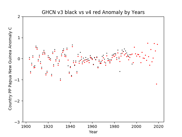
GHCN v3.3 vs V4 Papua New Guinea Anomalies
VERY significant range compression in the GISS/Hadley baseline years (about 1950-1990) then it widens out again with a bit of “higher highs”, then most recently it gets a cold year. Not looking at all like general warming over the years from CO2.
Malaysia

GHCN v3.3 vs V4 Malaysia Differences
Wow! Really cooling the past there in Malaysia. A full degree C colder in many cases; rising to only 1/2 C colder just before the baseline period. Then the baseline period kept at zero. (Remember this is just change between version 3.3 and version 4 for what is supposedly the SAME place and the same instruments recorded at one time in the past…) Then the recent data gets about a 1/3 C “lift” (but freezing the past has already created the slope needed…)

GHCN v3.3 vs V4 Malaysia Anomalies
Here we can see that it is no warmer now than it was in the past in the old version; but only after cooling the past a full degree C does that unfortunate fact go away.
Singapore

GHCN v3.3 vs V4 Singapore Differences
Interesting cold “adjustment” in the 1870s and then that dip in the late 1990’s is interesting, finally we end with an uptick of only about 1/4 C in the last datapoint.

GHCN v3.3 vs V4 Singapore Anomalies
Then the actual anomaly data shows a nice “dip” in the baseline period, but otherwise the actual temperature change has not been much at all over the years. Other than that one hot dot at the very end…
Brunei
Lookslike Brunei was also not in GHCN v3.3 so no “difference in anomalies” graph can be made:
MariaDB [temps]> SELECT year,AVG(deg_C) FROM anom3 AS A
INNER JOIN country AS C ON A.country=C.cnum
WHERE C.abrev='BX' GROUP BY year;
Empty set (0.48 sec)
So all we’ll get is the v4 anomaly data on the Anomalies graph:

GHCN v3.3 vs v4 Brunei Anomalies
Then this is too short a record to say much at all about climate. It’s about 35 years so only a tiny bit over one half the known 60 year cycle. Fitting a trend to cyclical data is a fools errand. I note in passing that recent years are about the same as the mid 1990s.
Philippines

GHCN v3.3 vs v4 Philippines Differences
Not much changed between the two data set versions. Looks like the W.W.II data changed a bit more.

GHCN v3.3 vs v4 Philippines Anomalies
So the 1800s were a bit of cold, then we see about 1-1.5 C of range in the Yr/Yr data until the “Baseline period” where the range narrows (closer to 3/4 C though near 1980 things are remarkably constant. In more recent years we have the return of some range (though it looks like minus some cold excursions) and the final temperature is very much like about 1965, 1942 or so, and around 1932. So while the slope of a fit line might well show a trend, the present temperature is not out of line with hot periods in the past. My best guess would be a bit of growth of the airport, UHI, and jet exhaust.
Palau
Oddly, Pelau right nearby the Philippines, has a different shape to their data…

GHCN v3.3 vs v4 Palau Differences
The deep past gets changed to a little cooler, then the present has a 1.5 C range to the CHANGES between version 3.3 and version 4 of what is supposedly the same place and data. Now Pelau isn’t big enough to have a whole lot of thermometers to chose between and among, so just why is the data that “mailable”? Eh?

GHCN v3.3 vs v4 Palau Differences
The actual anomaly graphs have the usual compressed “waistline” with reduced range in the “Baseline Years”, then with an otherwise almost constant spread and range of data from about 1950 to 1995, when suddenly the low ranges start to pull up. The spectacular bit, though, is the spike of roughly 2 C in the last few years. I’m sorry, but CO2 effects to not lurk for 40 years doing not much then suddenly show up in one year and stay for 3 or 4. That’s something else. Jet exhaust maybe? Isn’t that a big US Military spot?
Pacific Island Arc
This set is all those islands and atolls scattered around the Pacific Ocean toward North America (compared to the prior set). As ENSO tends to make an oscillator between the E and W sides of this basin, and some of these are N of the equator while most are S, I’m generally going to lay them out from near New Zealand over toward the Americas, but with those North of the Equator near the middle (some US owned Atolls mostly) set out separately. (Provided I can keep straight which of these rocks is classified as a what and who has had which name change and…)
Up North & Scattered
Here’s a few islands and atolls in the more northern part of the Pacific and scattered around a bit in the Big Empty.
Midway Islands
Midway also has no data in the GHCN v3.3 set:
MariaDB [temps]> SELECT year,AVG(deg_C) FROM anom3 AS A
INNER JOIN country AS C ON A.country=C.cnum
WHERE C.abrev='MQ' GROUP BY year;
Empty set (0.06 sec)

MariaDB [temps]>
So once again all we will get is the GHCN v4 Anomalies graph:
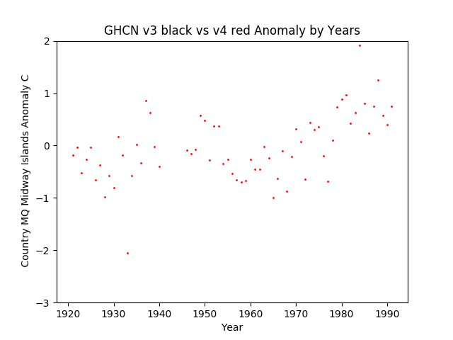
GHCN v3.3 vs v4 Midway Islands Anomalies
Other than a couple of “fliers” recently, the temperatures are rather like the hot points in the 1930s-50s. I note that the W.W.II years are missing. Low excursions are about the same in the 1920s-1940 and in the 1955-1975 range, then just “go away”. Rather like a 1/2 C “step function” happened in 1979. Very strange. Wonder if there was any equipment change then?
Johnston Atoll

GHCN v3.3 vs v4 Johnston Atoll Difference
Not much going on with Johnston Atoll. Then again they already have 2 C range in the anomaly (see next graph) so maybe nothing more was needed…

GHCN v3.3 vs v4 Johnston Atoll Anomaly
Once again almost nothing really happening until 1980, then a jump up; followed by another big jump up in about 1995. Odd little atoll. Wonder what was going on then… From the Wiki:
Chemical weapon demilitarization mission 1990–2000
Johnston Atoll Chemical Agent Disposal System (JACADS) building
Main article: JACADSThe Army’s Johnston Atoll Chemical Agent Disposal System (JACADS) was the first full-scale chemical weapons disposal facility. Built to incinerate chemical munitions on the island, planning started in 1981, construction began in 1985, and was completed five years later. Following completion of construction and facility characterization, JACADS began operational verification testing (OVT) in June 1990. From 1990 until 1993, the Army conducted four planned periods of Operational Verification Testing (OVT), required by Public Law 100-456. OVT was completed in March 1993, having demonstrated that the reverse assembly incineration technology was effective and that JACADS operations met all environmental parameters. The OVT process enabled the Army to gain critical insight into the factors that establish a safe and effective rate of destruction for all munitions and agent types. Only after this critical testing period did the Army proceed with full-scale disposal operations at JACADS. Transition to full-scale operations started in May 1993 but the facility did not begin full-scale operations until August 1993.
All of the chemical weapons once stored on Johnston Island were demilitarized and the agents incinerated at JACADS with the process completing in 2000 followed by the destruction of legacy hazardous waste material associated with chemical weapon storage and cleanup. JACADS was demolished by 2003 and the island was stripped of its remaining infrastructure and environmentally remediated.
Oh… So a lot of stuff shipped in, big construction, then years of running an incinerator… a BIG incinerator. I’m sure that had nothing to do with it… /sarc;
Wake Island

GHCN v3.3 vs v4 Wake Island Differences
Nothing changed much for years other than a roughly 1/4 C cooling of the past then BAM a 1.5 C range of changes in a few year and then back to not much change.

GHCN v3.3 vs v4 Wake Island Anomalies
Looks to me like another “Step function” of about 1 C in 1980 with a sight cooling trend over a cyclical spike of about 15 to 20 years. Not at all what steady increases in a warming gas would cause.
The more Southern Group
These are the islands that make an equatorial to South Pacific arc.
North Marianas Islands

GHCN v3.3 vs v4 Northern Mariana Islands Differences
Gosh, a 2.5 C range in teh anomalies just from variation in instrument chosen or processing. When you can get that much essentially “random” variation from what is supposedly the same small place and the same data / instruments, where are the error bars on that 1/2 C of “Global Warming” fantasy?
Interesting that this pushes up the “New Ice Age Comming” 1970s and pulls down the present. Just how crazy bad was this “Global Warming” chart that they needed to take 2.3 C out of it?

GHCN v3.3 vs v4 Northern Mariana Islands Anomalies
Gee from warming black dots to dead flat red dots in one “fix”. I wonder who got caught doing what and had to fix it? ;-0
Guam

GHCN v3.3 vs v4 Guam Differences
Another small island with big changes in their “historical” data. Looks like a tiny rise in the early ’80s, then a big 1 C cut around 2000.

GHCN v3.3 vs v4 Guam Anomalies
New data looks to be about as high as what was reduced. I guess it would look bad to have a “Halt” to “Global Warming”, so need to take a tuck in that older “hot” time and preserve the warming “trend” that way… I note in passing that the 1920s to 1940s are about as hot as “whichever hot now is really now”, and only the “baseline period” is nominally cool.
Fed. Islands Of Micronesia
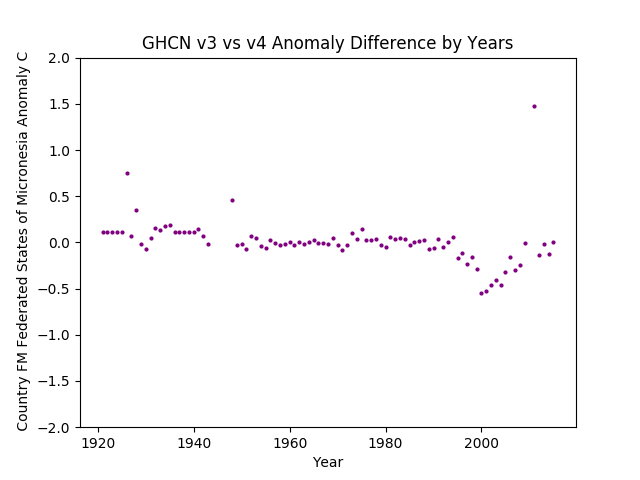
GHCN v3.3 vs v4 Federated States Of Micronesia Differences
Another one with a change “dip” around 2000.

GHCN v3.3 vs v4 Federated States Of Micronesia Anomalies
Oddly, even though in the same giant bathtub of warm water as Guam, these Islands have a cold 1920s to 1940s. Then essentially dead flat from 1950 to about 2000-2005 and only then a jump up (or smooth rise depending on version). Doesn’t look at all like a gentle persistent rise of 1/2 C due to CO2 and looks a whole lot more like ENSO, cyclical changes with step functions, or diddled data / bad measuring.
Marshal Islands

GHCN v3.3 vs v4 Marshal Islands Difference
Not much in the change department. Bit of a minor down tweak at the end.

GHCN v3.3 vs v4 Marshal Islands Anomalies
Other than the “dip” or “sag” in the “basline period” of about 1950 to 1990, not much in the anomalies either. OTOH, they have a nice 1 C range from bottom of the baseline to now pretty much baked in, so why change anything? Just ignore that pesky pre-baseline data and call it a warming trend.
Nauru

GHCN v3.3 vs v4 Nauru Differences
Changes all over the place and with a 2 C range. Big dropout from 1940 to 1960. Huge cooling of the hot 1930s.

GHCN v3.3 vs v4 Nauru Anomalies
Ah, that’s why. Turn a cooling down trend into a slight warming then throw away any recent data and anything newer than 1970. Can’t keep a place that’s getting cooler in the data now can we?
Kiribati

GHCN v3.3 vs v4 Kiribati Differences
Another “dogs breakfast” of changes. Almost 3 C of “fix ‘er up” done with cooling the 1920s to ’30s. Got to erase that pesky hot ’30s somehow. Then pull down the ’80s a little to erase the “pause” and make it a smoother trend.

GHCN v3.3 vs v4 Kiribati Anomalies
And “Bob’s Yer Uncle” a flat to cooling trend becomes a “warming out of the baseline period”. (Even though over all the data it isn’t warming, but no worries, nobody cares about data older than W.W.II).
Christmas Island

GHCN v3.3 vs v4 Christmas Island Differences
Again a big dropout of data in the baseline, then a nice 1/2 C of “Pop” added in 2000-2010.

GHCN v3.3 vs v4 Christmas Island Anomalies
So not erased the hot 30s & 40s here yet (which just begs the question how they could vary so much from nearby island to nearby island…) but did get rid of that annoying cold dip after 2000. Add a couple of juiced up hot years in the recent data and you too can turn a dead flat trendless Island into a Global Warming place. Just ignore that 30s & 40s data (don’t worry, it will be taken care of in v5, I’m sure… /sarc;)
Solomon Islands

GHCN v3.3 vs v4 Solomon Islands Differences
Another place with a 2 C range in the ‘fix up’ differences. Makes one wonder how bad the recent data are to need to much changing.

GHCN v3.3 vs v4 Solomon Islands Anomalies
Essentially trendless until after 2000. Even then not much (and mostly from removing low going excursions). Wonder if they moved the thermometer closer to a cement runway ;-)
Tuvalu

GHCN v3.3 vs v4 Tuvalu Differences
About a 1 C range of what looks like a few semi-random changes.

GHCN v3.3 vs v4 Tuvalu Anomalies
Nothing much at all going on until the year 2000 then a sudden jump up of about 1/2 C consistent with the 1940 temperatures. This will create a false trend if you plot a trend line from the “baseline period” to the present when at best there’s a cyclical thing happening (and at worst it is an instrumentation issue).
Tokelau
Oh man is this one a challenge / amusing:

GHCN v3.3 vs v4 Tokelau Differences
That big pop up of up to 1.5 C in 1965-70 range shows that somebody did go back and get different data, yet the result (graph below) is still just crazy time.

GHCN v3.3 vs v4 Tokelau Anomalies
A full 4 C+ of range, all over the place, with the most recent data quite cool. No trend until the late 1970s, then a massive pop up of 1 C for near a decade+, a drop of 4 C, and then it returns with mostly cooler data but still bouncing around by 2 C. This one is a real “Dig Here!” issue.
Wallis & Fortuna

GHCN v3.3 vs v4 Wallis & Fortuna Differences
One degree C of changes in the data with no clear pattern nor reason. So one full degree C of “jitter” can be in the data with no connection at all to CO2 (By Definition – since this is only the result of change in instruments or processing – and I doubt there were many instruments to change in Wallis & Fortuna).

GHCN v3.3 vs v4 Wallis & Fortuna Anomalies
Other than a “dip” in the baseline period (that rughly 1965-1985 low) it is essentially flat. Present temperatures essentially the same as around 1960.
Samoa

GHCN v3.3 vs v4 Samoa Differences
How unusual. the past is warmed in the v4 data and the present is cooled. I guess having 2 C of warming in Samoa didn’t look very CO2 physical as it was only supposed to be about 1/2 C.

GHCN v3.3 vs v4 Samoa Anomalies
We still have a nice 2 C of range, rising from -1 C in 1900 through 0 C (or equal to the average) in 1920 to 1980, then finally a bit of “lift” in the end with one year at +1 C and another at closer to +1.5 C. Yet the low years are about normal. Wonder what was in the missing years (and why “modern” data is missing but we have full data prior to 1995 or so…
American Samoa

GHCN v3.3 vs v4 American Samoa Differences

GHCN v3.3 vs v4 American Samoa Anomalies
Vanuatu

GHCN v3.3 vs v4 Vanuatu Differences
Vanuatu looks like another of those “too hot to be CO2 physical need to cool it” charts. Nothing much changes in the past, but the recent (“highest quality”) data gets cooled up to 3/4 of a degree C.

GHCN v3.3 vs v4 Vanuatu Anomalies
Basically a flat chunk from about 1950 to 1990 then a sudden jump up by about 3/4 C to 1.5 C. Anyone want to bet it became a “destination” then and the airport got bigger with more jet traffic and tarmac / concrete? But I can see where you would want to blend down that big jump into a more gentile rise. Doesn’t stand out as so odd then.
New Caledonia

GHCN v3.3 vs v4 New Caledonia Differences
A gentle cooling of the 1940s so they blend in with each side (can’t have them being about the same as now, can we?)

GHCN v3.3 vs v4 New Caledonia Anomalies
So now it looks like a steady flat period from about 1940 to 1965, then warming. Except most of the recent years data looks a lot like the 1930s.
Norfolk Island

GHCN v3.3 vs v4 Norfolk Island Anomalies
Nice little 1/2 C “POP” up in the recent years there. Wonder what that does?

GHCN v3.3 vs v4 Norfolk Island Differences
Oh, erases that cold dip… Realistically, this isn’t warming. A couple of recent years have a warm spike, but about the same as 1998 and the 19-teens, and with a (pre-erasure) cold dip in the 2010’s about like prior years too.
Fiji
Fiji is a bit of a trip. They change the recent data to about 1 C warmer and it is still cooling.

GHCN v3.3 vs v4 Fiji Differences
So about 1/2 C cooler in 1990 to 1/2 C warmer in the early 2000s. Looking at the graph below, it seems to have taken a “rolling off to cooler” in the black dots and turned it into a “continuing to warm”… Wonder if they manicure fingernails as well? /snark;

GHCN v3.3 vs v4 Fiji Anomalies
While it does look like a trend line from the “Baseline” years to the present would have a warming trend, the data overall do not. “Now” is no warmer than 1900 or 1930 or 1980. It does look like some low going excursions might be being clipped off. Airport cement anyone?
Tonga

GHCN v3.3 vs v4 Tonga Difference
Looks like about a 3/4 C range of mindless changes.

GHCN v3.3 vs v4 Tonga Anomaly
And more random coin toss than trend in the anomalies.
Niue

GHCN v3.3 vs v4 Niue Differences
Nobody changing much n Niue.

GHCN v3.3 vs v4 Niue Differences
And no “Global Warming” either… Guess that’s why the data get sparse after 1990, so it can be “re-imagined” and infilled via homogenizing from somewhere else.
French Polynesia

GHCN v3.3 vs v4 French Polynesia Difference
Again with the cooling of the baseline window… I think we’re getting a trend here… but not in the climate.

GHCN v3.3 vs v4 French Polynesia Anomaly
Pitcairn Islands
Poor Pitcairn Islands. Off near nowhere. Not important enough for anyone to diddle the data…

GHCN v3.3 vs v4 Pitcairn Islands Differences
Nearly nothing changed.

GHCN v3.3 vs v4 Pitcairn Islands Anomalies
No discernable trend to the anomalies / data… Guess “Global Warming” isn’t very global after all…
In Conclusion
IMHO the degree of change of what ought to be the same data from the same instruments between these “versions” of the “same” data indicate that any warming found is as likely to be error, or more likely to be error, than anything real.
Just looking at the anomaly profiles shows that islands located in the same body of water with nearly constant sea surface temperatures have very different profiles, or shapes of the plotted data. How do you do that when the environment is the same from island to island?
My best guess is that it is local siting issues (in particular measuring at airports with changes of size, materials, and traffic – from grass shack by a Pan Am Clipper seaport to 10,000 foot of concrete and Jet Age Vacationing), or just flat out lousy measuring.
What I do NOT see in the data is a general and steady increase in warming, year over year, across many stations; the kind of thing CO2 and radiative blocking ought to cause.
There will not be a Tech Talk in this posting as it is in the prior postings and all that changes is the letter code used to select for the countries. If you want to know more about the data base used, the codes, and the processing done, see the prior postings.

Pingback: GHCN v3.3 vs. v4 Anomaly Australia / Pacific Islands – Climate Collections
A couple comments about Guam data. Keep in mind that Guam is a small island 210 sq miles about 10 mi x 30 miles. It sits just off the Marianas trench (deepest water in the world) so has a huge cold water reservoir just off shore. It also has been a major military base since the 1940’s so has very high quality weather data (Anderson AFB was home of the B-52 bombers flying into Vietnam in the 1970’s and also a major air field and Navy facilities dating back to WWII.
If you look at GHCN v3 black vs v4 red Anomaly by Years and mentally reduce that scatter to the best fit line, you get an almost perfect 30 year cycle sine wave cycle with hot peaks near 1938 and early 2000’s and a cold dip centered on the mid 1970’s.
Note that super typhoon Amy 1971 swept right past the island on the south side,(after crossing the Marianas trench) then swung north on the west side of the island.
I talked to submarine crew after we got back in port and they were getting rocked by turbulence several hundred feet deep.
So it could have mixed a lot of that deep cold water to the surface.
I would love to see a best fit polynomial curve to that plot, with the zero slope points marked.
Em Thanks a heap for this.. It is too early in the morning for my brain to be functioning up to speed. But one really weird things struck me. What is going on with Samoa/American Samoa ?
Geographically this is the same island group just divided into two politically. The raw data should be the same !
More later when I have really woken up.
Bill
@BillInOz: You are most welcome, just hope it is useful.
What gets me is just that. Many of these Islands are near enough to padle between them, but very different records. That’s not climate and CO2, that’s land use and instrumentation or process.
Then some are just horrible qualty and coverage. Average all that together, you get crap not truth.
@Larry L.:
Interesting stuff. That’s one of those things I’d love to do, but have not the time. Take each country or island. Match the instrument locations and change hustory, then put next to it a contemporary news and weather report history. I think it would become much clearer what’s going on. Like that Johnston Atoll incinerator, or that grass runway in1935 that’s a major jet port now, or when a cold plunge really did happen so don’t “fix ir”…
E M Re Australia doing some digging :
1 : The slight cooling since 1850 is a real interesting surprise ! But I wonder how many thermometers there were in 1950. I suggest not many. Perhaps 6 in all in the major settlements : Sydney, Hobart, Brisbane, Melbourne Adelaide & Perth.
2 : All those places are coastal where the sea plays a big influence in weather & climate compared to inland locations.
3: But the addition of lots of temperature gauges at inland locations as time passed should have lead to higher average temperature readingsi
4 The dots for 1850 n the V3 vs v4 which show up being ~1.5 degrees cooler are a real puzzle for the reason given above – coastal location.
5 I tried to see in these charts the droughts that we have had in Australia. The big bushfire years are all drought years. Some of the major ones happened in these years : 1939, 1971, 1984, 2006-9. 2015, 2018-9. But these major climatic events are not visible.. perplexing !
Re=-posted your conclusion on Jo Nova E M : http://joannenova.com.au/2019/04/huge-bang-and-house-burns-to-the-ground-just-an-e-bike-battery-mishap/#comments ( Comment 38.1 )
IT’S RAINING IN THE ADELAIDE HILLS !
Raining soft warm & gentle..The best way for rain to fall,
Soaking in to the soil and bringing new life..
Us farmers call this annual renewal ‘The Break’..
It comes every year – almost !
For there is the odd year when it doesn’t.
Or is far too late.
But it is regular enough,
Predictable enough, that
Many South Australian farmers
This is truly the start of farming year.
So much for the fears aroused by
“‘Climate Change” Alarmists…
We are fortunate that Mother Nature
Pays no attention to them at all.
And I suspect that Mother Nature pays
No attention either to our “Prayers of thanks’
But still none of want to arouse the ire
Of the Weather Gods
Pingback: GHCN v3.3 vs v4 Asia Anomaly | Musings from the Chiefio
Pingback: GHCN v3.3 vs v4 – Top Level Entry Point | Musings from the Chiefio