
In this earlier posting:
https://chiefio.wordpress.com/2019/02/07/ghcn-global-thermometers-sine-globe-with-labels/
I made a couple of maps showing the Baseline era stations in blue, and the year ending (2015) stations in red. This lets you see what is being compared to what. Then a question from Larry L. got me to give a quick “thumbnail” of how the global temperature stuff is done.
Basically, last time I looked, GIStemp had gone to 16,000 “grid boxes” into which they stuff a fabricated “temperature”. Since there are only a bit over 2500 current thermometers, and 7000 at the max ever, most of those boxes really have no data. Those that DO have data may have it adjusted based on a variety of things. To fill the boxes the “Reference Station Method” is used to create a temperature guess based on some other thermometer up to 1200 km away.
Well, looking at Australia it had a huge baseline population of thermometers, but very little left now. That got me wondering “What would it look like to just toss all the thermometers on one graph?” Since the stuff is being made up based on all of it, let’s see all of it. At the same time, looking at all the months mushed together would not show trend well. So I decided to pick just one month. In this case, their hot one of January. It is plotted as a scatter plot just after the two globe views of baseline / current.
Year runs up and down. I tried to make it go side to side, but for some unknown reason that throws an exception. Perhaps I’m over running some size limit in the array functions or “whatever”. To some extent I found this more useful anyway as it causes you to think about the data differently.
With that, the graphs:
The Globe – GHCN v3.3 Baseline only Stations vs 2015 “now” Stations
I’ve put both the baseline and the “now” stations on the same map, but those only NOW are red ( 1/2 transparency) while those only in the baseline are blue (full color density). This means a red on top of a blue will give a purple, but a whole lot of reds will tend to hide the blue, and out in the boonies you can see the light red vs the blue as what was dropped vs kept.

GHCN v3.3 NOW in red 50% transparent over Baseline in Blue
Then, since the RED tends to swamp the blue where there’s a lot of thermometers now, I’ve also made one with red first, then blue as 50% transparent over it.

GHCN v3.2 Baseline blue 50% transparent over 2015 “now” in red
Australia
Here is ALL January data for country 501 – Australia. Scatter plot.
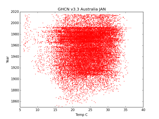
Australia all January temperatures
Look at it for a minute. Think about it. See what you think it says. Then read my ideas a bit further down. Next is July, their winter.

GHCN v3.3 Australia July Temps
Think about it a bit too. Remember the “baseline” used by GIStemp is 1950 to 1980 while Hadley use 1960 to 1990 last I looked.
My Ideas?
It sure looks to me like the top end is NOT any hotter, and in fact a bit cooler. Then it looks like a bunch of “medium cool” data sources just go away at that hard cut off about 1990. Now I know they claim to use “anomalies” so that magically removes and all biases ever from anything they do (/sarc;) but really? Any “warming” in the actual body of the data only looks like it shows up as a dropping of thermometers reporting cold values.
There’s still some really cold source (likely the island off to the south), but a bunch of the “middling cold” just goes away.
Overall the dispersion reduced in both directions. There is NO hotter hot happening. It is only the center of mass of the temperatures that has been moved via pruning out a bunch of data sources. Any “warming” isn’t from getting hotter, it is a statistical artifact from the data distribution change.
That’s what it looks like to me.
I’m going to try a couple of other countries and see if any of them look interesting too. As I find interesting bits, I’ll append them to this posting.
I’m not going to post all the code as it is very repetitive. Just one example. Then you change the country code and month to change the graph (and make color and range limits something that works for that data).
# -*- coding: utf-8 -*-
import datetime
import pandas as pd
import numpy as np
import matplotlib.pylab as plt
import math
import MySQLdb

plt.title("GHCN v3.3 Australia JULY")
plt.ylabel("Year")
plt.xlabel("Temp C")
plt.xlim(-5,30)
plt.ylim(1850,2020)

try:
    db=MySQLdb.connect("localhost","root","OpenUp!",'temps')
    cursor=db.cursor()

    sql="SELECT T.deg_c, T.year FROM invent3 AS I
    INNER JOIN temps3 as T on I.stationID=T.stationID
    WHERE T.country=501 AND T.deg_c>-90 AND T.month='JULY';"

    print("stuffed SQL statement")
    cursor.execute(sql)
    print("Executed SQL")
    stn=cursor.fetchall()
    data = np.array(list(stn))
    print("Got data")
    xs = data.transpose()[0]   # or xs = data.T[0] or  xs = data[:,0]
    ys = data.transpose()[1]
    print("after the transpose")

    plt.scatter(xs,ys,s=1,color='blue',alpha=1)

    plt.show()

except:
    print "This is the exception branch"

finally:
    print "All Done"
    if db:
        db.close()
Update Canada
Yes, an update already. Canada looks to have similar issues, though the data slew more (oddly, it looks to me like it was slewing toward colder then got chopped). I did change the program to plot both graphs at once.

Canada July Temperatures GHCN v3.3

Canada January Temperatures GHCN v3.3
It does look like the same basic issue to me. Lots of “middling cold” stations in the baseline, then dispersion cut down in the present stations. No actually hotter records, just loss of some places providing colder ones. Statistical artifacts, not actually warmer temperatures.
Here’s the code that does the 2fer graphing. It pauses on each graph until you close that graph, so you can study and then save it. In the original the SQL is all one line, I’ve pretty printed it here with linebreaks so it is easier to read.
# -*- coding: utf-8 -*-
import datetime
import pandas as pd
import numpy as np
import matplotlib.pylab as plt
import math
import MySQLdb

plt.title("GHCN v3.3 Canada July")
plt.ylabel("Year")
plt.xlabel("Temp C")
plt.xlim(0,30)
plt.ylim(1850,2020)

try:
    db=MySQLdb.connect("localhost","root","OpenUp!",'temps')
    cursor=db.cursor()


    sql="SELECT T.deg_c, T.year FROM invent3 AS I
    INNER JOIN temps3 as T on I.stationID=T.stationID
    WHERE T.country=403 AND T.deg_c>-90 AND T.month='JULY' ;"
    print("stuffed SQL statement")
    cursor.execute(sql)
    print("Executed SQL")
    stn=cursor.fetchall()
    data = np.array(list(stn))
    print("Got data")
    xs = data.transpose()[0]   # or xs = data.T[0] or  xs = data[:,0]
    ys = data.transpose()[1]
    print("after the transpose")

    plt.scatter(xs,ys,s=1,color='red',alpha=1)
    plt.show()

    plt.title("GHCN v3.3 Canada JAN")
    plt.ylabel("Year")
    plt.xlabel("Temp C")
    plt.xlim(-40,10)
    plt.ylim(1850,2020)


    sql="SELECT T.deg_c, T.year FROM invent3 AS I
    INNER JOIN temps3 as T on I.stationID=T.stationID
    WHERE T.country=403 AND T.deg_c>-90 AND T.month=' JAN' ;"
    print("stuffed SQL statement")
    cursor.execute(sql)
    print("Executed SQL")
    stn=cursor.fetchall()
    data = np.array(list(stn))
    print("Got data")
    xs = data.transpose()[0]   # or xs = data.T[0] or  xs = data[:,0]
    ys = data.transpose()[1]
    print("after the transpose")

    plt.scatter(xs,ys,s=1,color='blue',alpha=1)

    plt.show()

except:
    print "This is the exception branch"

finally:
    print "All Done"
    if db:
        db.close()
I ought to make this take passed parameters for Country Code and such, but I’m not going to do every country… Though I might do a couple more somewhere “interesting”…

Much better map projection!
~ ~ ~ ~ ~
A couple of folks from OZ have looked at their data, and describe serious issues.
For example, current sensors report instantaneous reading. Older methods would not have recorded a microsecond high spike. There have been numerous posts on Jo Nova’s site – not her personal research – but hers is a place for others to get the message out.
~ ~ ~ ~ ~ You wrote:
“ most of those boxes really have no data. Those that DO have data may have it adjusted based . . .”
A few years back someone explained that from time to time old data appears to change. The idea was that if someone finds an important issue with a station, say it was moved, and that requires adjusting its data from that point in time, AND it was used as one of the stations within 1200 km to “create a temperature guess” – then lots of infilled numbers get changed on the next scheduled update of the data base.
Some folks claim that these sorts of things make no real difference
to a global average surface temperature. Maybe not, but I do a big yawn when any reported record is less than about ¼ Celsius degree.
Did I mention Washington State is in the grip of ~a 3 week cold outbreak. The cold produces fluffy snow and the wind moves it and piles it in other places. Roads, schools, airports and so on close.
All of lowland Puget Sound region got snow. Olympia had 11 inches. People don’t know how to cope and communities don’t have equipment. With the warnings, folks went shopping and left markets with many empty shelves.
It’s been fun to watch. (No deaths yet.)
E M, great work, I think Canada shows it is even worse than OZ, as it is predominantly colder there their cutting action is much more obvious.
I think you will find the USA quite instructive as well, as I have a graph of Actual Temps that show major Steps in the data, those steps appear to be Site Culls also.
Very interesting. And surprising. So both Australia and Canada show a distinct reduction in stations around 1990. I wonder why? This is about the time the GHCN was created. Maybe the initial collection and load of the data was more extensive than subsequent additions?
Australia also has another discontinuity at 1910 (it looks like). Canada doesn’t though, and instead there is steady increase in stations, which is what you expect really.
It would be interesting to see if the same patterns show up in some other countries. It would be worth including a couple of small countries too.
I would think that it would be easier to see where the march of the thermometers was going if the median of each temperature line was plotted as the data goes up through the years.
Perhaps that would better reveal what the effect of the change in the number of thermometers reporting was on temperature. I’m thinking median as opposed to average because the median relates more to the number of thermometers and lessens the impact of temperature spikes and dips on the central value.
Hard to say if that would be useful or a waste of time and keystrokes.
@John H.F.:
Be warm, stay safe! A few days ago iceagenow.info had a story about snow all over the Pacific coast and even down here in Sillycon Valley hills. I can confirm that: There was snow on Mt. Hamilton and well down the slopes – then rain removed the lower bits lately.
The thing that I find most compelling about the graphs above is not the loss of thermometers (that IS a big deal IMHO) but rather how the hot values do not rise and there is no visible “skew” to the mass. There simply is nothing of what you would expect in generally increasing warmth. Were there generalized warming, the “blob” ought to oh so slowly skew to the right (hot) over the years by about 1/2 C to 1 C (some sites warm faster…). But it just isn’t there.
What IS there is dropout of ‘middling cold’ stations that WILL be infilled (as they are in the baseline) with “something” fabricated by reference to the stations that DO exist – those warmer ones. The assertion is that The Reference Station Method makes this fabricated data so effectively it can not have 1/2 C of error in it. (I don’t think they ever actually state that so boldly, but rather that the 1/2 C of warming found is real and that the R.S.M. lets them do it without that being an error.)
Just eyeballing the data it looks to me like there is NO real warming of the top end, and that the many degrees C of “dropout” gets an error of about that 1/2 C of “warming” leaking into their work product.
@A.C.Osborn:
I did the USA but two things make the graph harder to read. First, with so many more stations, the dropouts are lost in a sea of red ink. I need a visualization that doesn’t let that happen. Perhaps playing with transparency or different colors by tranche. Second, there are a few clearly erroneous outlier data points that make the actual body of the graph very thin. Yes, I can change that with either masking them ( I put a above / below test set into the program to toss impossible values) or just setting the graph width such that they are “off the edges”; but for the first run I just wanted to show “All the data and nothing but the data”…
The more striking ones are actually some of the more minor ones. A change of a few is a bigger % of the whole. The “Ship Stations”, for example, essentially stop about 2000 A.D. It is as though they said “We have Argo now, forget ships”. Yet Another Instrument Change… now comparing ship intakes and buckets to data imported from Argo (as a Hadley SST overlay for the oceans).
I did another dozen graphs, then decided sleep sounded good ;-) It’s easy to do them, maybe 3 or 4 minutes each (mostly adjusting graph width and running it a couple of times); but I’m not sure posting 200 graphs is all that useful once the point is made by a few…
@H.R.:
Interesting idea. So you are saying “For each year (line of data) find and plot the median value”? I could also see “Find and plot the median value for the whole body of the data”. Then that ought to give one midline and a sloping / side stepping line…
“How to do it” is an interesting question. I think it would involve array math and variable stuffing (by year) then plotting three things (data, 2 lines) then displaying. After morning coffee I’ll try working out how to do that in Python ;-) I’m starting to get a grip on the language… but the non-procedural and do-a-bunch-hidding-off-in-an-array-func are still a bit alien to me ;-)
I suppose a similar line at THE max value reported might also be interesting. Would show the lid on the data that I’m just visualizing…
@John F. H.: “Older methods would not have recorded a microsecond high spike.”
You’re the guilty one 😜. What you wrote is what got me thinking of plotting the median instead of the average.
When you look at a point on a graph of the median, you say to yourself, “Half of the thermometers were above/below that value.” If the number of thermometers is visually dense, you have more confidence in the central value. If the number is sparse, you can easily see that one or two high temperature values would strongly influence the results.
What I don’t know is if the line of median points would show more less warming compared to the line of averages, and if the differences between the mean line and the median line were noticeable due to the change in numbers of thermometers.
While your are at it, graph the mean, the mode, and the median lines. Those are the three common stats. It will give us a clue about skew and such.
Here’s how to do median and mode in MySQL.
https://www.benlcollins.com/sql/mysql-averages/
@E.M.: Yeah, I realize your time is spoken for on various fronts (Heard in the background, “Finish cleaning out that garage dammit!” 😜)
So I was just suggesting that plot as a “when you get a round tuit”, if ever.)
HR@https://chiefio.wordpress.com/2019/02/10/an-intriguing-look-at-temperatures-in-australia/#comment-107574
Now he can do it by just copying and pasting the SQL in the link @
then a little touch up to use the temp data.
Viola!
Related?
http://joannenova.com.au/2018/04/bom-homogenization-errors-are-so-big-they-can-be-seen-from-space/
@Ossqss:
Related but not the same. About 2010? I noted a step change in the data that happened in different places at different times. I speculated it was the automated station rollout. I probably need to redo that on the New Homogenized Data Food Product to see what they have done to it.
But yes, I learned in UC Chemistry that THE guarateed path to bogus calorimetry results was to change or even just touch the thermometers. Changing all of them to a different tech is guaranteed to make error. Dropping a bunch of old ones and then infilling with fantasy will make that worse and spread it all over.
What needs attacking is the foundation of The Reference Station Method and the thermometer swap.
As I’m using unadjusted for these graphs there ought to be minimal homogenizing in them.
@Jim2:
Thanks for the link. Saves my a bunch of digging around :-)
@H.R.:
I think I’m over the hump on the Python & SQL language learning. Still a lot of detail to go, but it comes as you need it. I’ve been making different graphs very fast lately. About 1 to 2 hours for very different, couple of minutes for minor mods. Mostly spent fiddling the SQL until the data columns are right, then graph details. Learning things like sub-queries being most of the hour ones.
I can likely add the median line after church.
On my dance card is a v4 download but that can run in the background and then I need something to keep me busy until it completes…
I’m happy with the rate of progress and new skills, especially given it is part time on a schedule that skips some days entirely.
Obligatory Nag:
Of course, since I’ve published all the SQL database build, query, and Python code, including how to install it on a $50 computer… nothing prevents anyone else from joining in :-)
End Nag.
FWIW, once things stabilize, I.E. not changing database schema, I expect to make a summary HowTo posting with build script all clean and in one place, so would be easier to join in then, if desired.
Re: Obligatory Nag…
I really ought to grab that data. However, my plate is exceedingly full right now. Aside from my day job, I’m spending almost every spare moment at the theater or preparing practice tracks for the blind member of our community chorus. When the show finishes, then I have to get up to speed on the accompaniments for the students who will be going to contest.
I’m tempted to try my hand at one-by-one processing because it sounds like, for any one location, there are a wide variety of temps.
Big-brush SQL techniques feel powerful, but sometimes I need to use an eyelash-size-brush technique.
Or maybe the method I use for filling in addresses that have many options and you never can tell which option they used.
Gotta go. Got a matinee in an hour.
My only reason for The Nag is the hope that I can plant the seed of data adventure and get someone else looking at things. When is entirely open…
Well, having read the HowTo median and modes, I’m now VERY thankful for the link. More complicated than I’d expected.
I might take a look at doing it on the Python side. I think they are standard functions in a library (but I’m still a bit rough on getting array functions to do just what I want…)
https://docs.python.org/3/library/statistics.html
I think that’s my first sort of request ever, E.M.
I’m well aware that it’s way, way rude to ask somebody to do something when you haven’t tried it yourself. But I thought you were in “looking for playtime ideas” mode so I wasn’t asking for your time; just if you were so inclined.
Actually, I’m reading the code and I am beginning to recall things from the old days when I did program. The way you are documenting it in comments makes it pretty much understandable as to what’s going on and what you are doing. Color me surprised and pleased. And take a bow yourself for a good presentation.
But no. I won’t be playing with any data set any time soon unless you pry my fishing pole from my cold dead fingers. 😆
(Bought a new reel yesterday. Loaded it up with about 360 yards of 40# braid. It’s already mounted on a 10′ fast action medium weight Ugly Stik, replacing a crap reel that came with the rod. I picked up the reel at Gator Jim’s in St. Pete. Headed out shortly to see how far I can fling one ounce of lead + bait.)
Thank you for the graphs. A few comments.
The Bureau of Meteorology in Australia believes temperatures started in 1910 (when they started functioning). Previous temperatures are regarded as ‘suspect’ (wrong method/equipment etc.)
The earliest Stevenson screen (in Aust) seems to have been installed in Melbourne in the 1860’s because there is a press item from 1869 about it being moved to a different part of the park.
All of the State capitals had Stevenson screens before 1900, and there were others in regional centres as funds were available. Those in the Capitals were often relocated (except Sydney where it stayed on Observatory hill and had a freeway built around it.
Those temperatures in January below about 7℃ which start around 1950 are unlikely to be on the mainland or even Tasmania (even on Mt. Wellington which towers over Hobart and can get snow 12 months of a year) but may represent new stations on Macquarie and Heard Is. or perhaps Mawson base on Antarctica (manned since 1954).
The HADCrut figures show “global temperatures” from 1850, but the entire southern hemisphere
until around 1860 was based on a single thermometer on an island in Indonesia. Now that is infilling data into vacant boxes.
Clive Best mentioned or blogged that they’d recently dropped a lot of South American temperature stations that had been cooling. That way they can continue to assure themselves that the global warming trend continues to match their alarmist computer models.
@H.R.:
No worries. Wasn’t directing anything at you, or at anyone. Just a general statement to anyone out there that this can be a participation sport ;-)
And yes, I was and am looking for ideas as to what is interesting. Saying “You too can make beer” does not mean I’m uninterested in someone saying “Try making a Porter…” ;-)
@Graeme No.3:
Interesting bits of history there. Similar issues are found all over the globe. Much of the Pacific Ocean is a temperature vacuum until recently (in historical terms). Then there are the huge drop outs during wars, and as Empires retreated from the 3rd World and the folks there didn’t give a damn about those White Man’s Boxes. Antarctica is just blobs in any given spot as some country occupied its base for a few years, then didn’t.
Frankly, there’s only a few hundred well tended thermometers with a good long history, and they are now being homogenized into shit (and / or being replaced with automated things that give different results so are not really comparable.). But no worries, Magic Sauce Statistics fixes it all up just fine… /sarc;
@J. Martin:
Yeah, that’s a big part of the Game, IMHO. Drop things that are cooling or static and “in fill” with stuff from those at airports and UHI then compare the “anomalies” to the grass field from 1890 and claim the world is warming…
@All – a Minor Rant per Python:
Yea though I walk through the valley of incompatible versions and name overloading, I shall fear no definition…
Sigh.
Couple of hours sunk into trying to find out how to get mean, mode, etc. using those wonderful built in Python library functions. There’s a nice statistics library you can import, only into 3.x with a median(),. Then NumPy has a median() but it isn’t there just by importing Numpy you must import it FROM NumPy too… and I did get it to work; but breaking it out by row is a PITA as something called “broadcasting” barfs on array dimension changes, but you can fix that … using a different method for each of the Pythons and versions of Numpy…
https://stackoverflow.com/questions/32030343/subtracting-the-mean-of-each-row-in-numpy-with-broadcasting
but Lord only knows what version I’m running and which one it matches…
Somewhere along the line I’m pretty sure there were a couple of examples using some OTHER median() from some OTHER library…
Tower of Babble all in one language…
Then folks wonder why I just go get something done in 2 minutes in FORTRAN and “move on”. I’m sorely tempted to just compute a mean / year in FORTRAN and load it into the database… but I’m going to take that lumpy SQL path first… It doesn’t look as enticing as the Python Library “Look it has mode, mean, and median right there as functions!” but SQL doesn’t have the 20 shades of WT? constantly mutating language, libraries, and how to do something.
I’m sure for folks who have spent a decade in Python they know all these quirks of things and just avoid the land mines; but I must say Python, largely due to “many incompatible ways and versions” along with “what you want to do is hidden in a library you do not know about in a function you do not know in a way you don’t expect” is about as Nooby Hostile a language as I’ve seen in a long while. Despite the write ups saying it is easy and good for teaching. That is only for the very basic initial bit, then it ramps up hard.
Realize I’ve used: C, FORTRAN, PL/i, Ada, COBOL, ALGOL, Pascal, Perl, sh, ksh, csh, Forth, APL, BASIC, Assembler (couple of machines), Ramis II (DB), Focus (DB), HP Image/Query DB, and a few others I can’t remember at the moment (wine is being applied to sooth the frustrations…) so it isn’t like I’m coming at this as a Poor Johnny One Lang.
This is NOT a language suited to “discovery”. Entirely from being very “Untidy” with significant incompatibility between versions and library availability at every turn.
With that rant out of the way, I’m going off to use the SQL “tips” in the page Jim2 linked as I KNOW it will work, one way, as advertised…
I admire your persistence and ability but I seriously doubt whether the so-called temperature records are worth anything. For an example of the ‘adjustments’ see
http://joannenova.com.au/2015/08/the-bom-homogenizing-the-heck-out-of-australian-temperature-records/
I do like the comment of the Icelandic meteorologist who said “I hope that GISS don’t adjust our 1904 temperatures any lower or my 4 grandparents will freeze to death before they can have children”
And for the actual records e.g. the site in Columbia with 2 months of temperatures above 80℃, or the tropical island that froze in spring etc.. That is the HADCrut version, supposedly the best.
http://joannenova.com.au/2018/10/first-audit-of-global-temperature-data-finds-freezing-tropical-islands-boiling-towns-boats-on-land/
And here in Adelaide we’ve just broken our temperature record from 1939, much to the relief of the BoM and the TV stations all hyping the event 2-3 days beforehand. Yes, it got to 46.6℃ at 15.36 hours. By 15.50 hours the temperature was supposedly down to 45.2℃ although stations to the S, W, E and N didn’t show any cool change passing. It is an automated station so no (unauthorised) person could have touched the sensor. A bit like Sydney’s new record which was many degrees hotter than the nearest thermometer which was on the harbour 300 metres from the busy freeway.
In any case averaging the maximum and minimum temperatures says little about anything. If you have a humid tropical day with a minimum of 20℃ and a maximum of 28℃, is it hotter than a very dry place with minimum 15℃ and maximum 35℃?
@E.M. – Actually I personally took the nag as encouragement; a bit of a prod. And I did take it to be a general, “Don’t just stand there. Feel free to join the fun.” sort of comment.
I must admit I am getting a little stirring of interest again. And should fishing go south on me… who knows?
OTOH, I’m following p.g.’s project with interest. There are a few things I have in mind that I’d like to make, so if fishing goes south, right now I’d be more inclined to mash some thumbs on a physical project rather than move my fingers around on a keyboard.
Please! Keep posting your code and results. It is the parable of the sower who casts seed on the wind; some of which is eaten by birds, some that falls by the wayside and never sprouts but some lands on fertile ground and brings forth a great harvest. Ya never know. 😁
Interesting recent cold record-setting temps On Hokkaido Island, Japan, mentioned here:
http://notrickszone.com/2019/02/10/japans-northern-island-of-hokkaido-shock-freezes-coldest-air-mass-ever-recorded/
@H.R.:
I sometimes take a pocket notebook fishing with me, so when things are slow and an idea strikes, I can write it down or work it a bit.
This usually only works for the first hour or two, then, well, when beer fishing I always catch my limit ;-)
Much as I’m griping about Python, I do think it is benefitting me to absorb the “different” way it does things. That joke poster link about essays was right on with the comment about importing everything. The basic core is simple and inadequate, then a huge load of functions (pardon “objects and methods”) get imported to do anything of interest. Of course, they are not in the language, so all black boxes… with quirky limits and incompatibilities, hard to discover…
I wonder how many of them are written in C or maybe even Fortran? 8-)
So, like hiku I’m choosing the discipline of the harder path…
By comparison, SQL / MySQL it a slightly too small language, but without surprises and delivers well. In a day you can do things, and good at it in a few. Easier and faster as you do more (where Python pushes out to hidden library land and becomes harder and slower…)
OTOH: I’ve already written some terse dozen line Python things that would be a few pages in other languages, so that is gratifying.
It mostly reminds me of learning APL. Starts out easy and rapidly ramps to fatigue and puzzlement. Hidden things you are expected to “just know”… Can do a lot in few lines, but needs more thought time to get there. APL was much worse though. Alien character set and a dozen symbols is a very big program. “Write only programming” was the joke about it…
Oh well. I cursed at C when I was learning it, too :-)
I don’t recall the number of rows you are dealing with. If over a million, then …
https://www.vertabelo.com/blog/technical-articles/everything-you-need-to-know-about-mysql-partitions
Well Cheifio I’ve been out of the loop on the past few days. A computer thta dudded on me. Or maybe got hacked ?
But I’m interested in this post and the comments and glad you have turned your attention our way.
But I have no idea what to make of the charts up there at the start..
Maybe I’m just tired ?
I am perplexed about one thing…I think the BOM still has around 700 automated weather stations operating over the continent. But most of them are concentrated in the areas where most folks live. That’s probably . about 20% of the total land mass of Australia. And there are far fewer out in the 80% of the continent.
And as you mentioned where we folks are with our buildings and roads and concrete & vehicles and A/C units etc etc, there are inevitably Urban Heat Island Effects.
Cool! Give that man a vegemite sandwich. )
Global T trend, Sans computers, what would a scientist do?
Likely a study of the few hundred decent long term stations and then some site adjustments to known physical changes, maybe Trent comparisons of 100 year stations to local well sited stations over the same shorter periods. Then show what was fine and the differences.
Now, thanks to computers, one can fubar the entire data set, call it hit and say humans done it. Every month hundreds of real stations are adjusted two or three hundreds of one degree. Why? Not for any physical reason. Because an algorithm in a code says to.
So is there observable evidence they are wrong. You bet!
1. Long term tide gauges adjusted for land movement show ZERO acceleration in SL rise.
2. No trend in seasonal NH ground coverage of snow.
3. Long term USHCN stations using raw data ( Tony Heller’s site) consistently show no increase, if not a decrease in hot days over 100, over 90, over 80, etc, and run counter to the homogenised mish mash passed to the general public as a thermometer reading.
4. A documented record of scientists gone political, erasing the blip, erasing the MWP, admitting to FUBAR in private, erasing the ice age scare, adjusting Arctic and Antarctica data contrary to common sense and meteorological records in those areas. etc. Ignoring past natural events, making false claims of “unprecedented” weather events, claiming once in 500 year anomalies to weather events that happen three to five times a century.
5. The global disaster is MIA. No global increase in… drought, floods, hurricanes, lands inundated by rising seas, tornadoes, etc… ( There is however, a great increase in reporting on these natural disasters and an amazing upward trend in funds to “scientists” to predict disaster)
6. The snow keeps falling, crop yields keep increasing ( The KNOWN benefits of CO2 are manifesting globally) Ski resorts stay open. Islands increase in size instead of shrinking. Great lakes ice decreases and the press goes wild, Great Lake ice then increases and the press goes silent. Dada dada dee, dada dada da, the beat goes on.
@Bill In Oz:
on the red chart, look at the 10 C to 15 C temprrature range. Notice it is full of spots from about 1910 to 1990 ish, then nothing.
The stations dropped were preferentially those with a midfling cool temperature.
Similar thing on the blue graph.
The “center of mass” of the spots ends up shifted. The high end also comes in some, but not as much.
So in both cases, what now would be outlier ranges must be made up by The Reference Station Method so that there is something to compare to the baseline data in those places.
“Global Warming” of necessity, rests on those made up replacement temperature being accurate to tenths of a degree… I think that impossible. With low volatility data as the source, it is highly likely that the high volatility outlier cold stations will be “made up” just a bit less volatile, so warmer, than reality. I’d guess by about 1/2 C….
Note that cold excursions go further faster than hot ones. Heat likes to leave, accumulates slowly, and evoporating water starts to limit it at about 85 F (where hurticanes spin up for massive heat transport). For cold, the water cycle literally freezes up, convection stops, and a Mobile Polar High can plunge you from 20 C to -10 C in a day. So preferentially removing middling cold stations trims the volatility to the cold side…
Pingback: GHCNv3.3 By Continent – Scatter Graphs | Musings from the Chiefio
Speaking of Australia, looks like they are going to get an antarctic surge into Australia due the jet stream, and reduced solar heating.
E.M.
Maybe you can weave the change from ACORN 1 to ACORN 2 into this?
“Another bureau rewrite warms Australia’s climate history”
My comment at Jo Nova
“el gordo
Following info from another poster here I got a copy of “The Weather Watchers” – the book of the BOM’s first 100 years.
Can’t be much demand as the library system got it pretty quickly.
By their progress to Acorn 2 the next volume might well be called (IMO)
“The Weather Makers” ”
http://joannenova.com.au/2019/02/australians-destroying-their-grid-faster-than-any-country-on-earth/#comment-2104967
Supplimental, along with a long list of troubles at the end.
http://joannenova.com.au/2019/02/australias-new-hottest-day-just-discovered-not-albany-or-oodnadatta-but-carnarvon-51-degrees-in-1953/
Pingback: GHCN v3.3 vs v4 – Top Level Entry Point | Musings from the Chiefio