
In the posting on Australia, in a comment by KeefInLondon (h/t) he suggested:
Very interesting. And surprising. So both Australia and Canada show a distinct reduction in stations around 1990. I wonder why? This is about the time the GHCN was created. Maybe the initial collection and load of the data was more extensive than subsequent additions?
Australia also has another discontinuity at 1910 (it looks like). Canada doesn’t though, and instead there is steady increase in stations, which is what you expect really.
It would be interesting to see if the same patterns show up in some other countries. It would be worth including a couple of small countries too.
Well, I’m going to do that. In fact, I’d already made a dozen or so graphs of other countries including some of those smaller ones. Some are interesting. However, it lacks context. So I’ve decided that first, I’m going to just post up ALL the data in EACH “region” (or roughly, continents plus ships at sea). That, then, gives you the comparison context for any given country. Each country will be a part of these continent scale blobs, so seeing the big trend will let you then look for “who is doing that” inside that blob as countries and groups get graphed.
I’m going to do them in reverse order, since Region 8, Ships, is the most interesting. But first, here’s the region number / name set:
mysql> SELECT * from continent;
+---------+-----------+--------+---------------------------+
| version | ascension | region | region_name               |
+---------+-----------+--------+---------------------------+
| Gv3     | 7Sept2015 | 1      | Africa                    |
| Gv3     | 7Sept2015 | 2      | Asia                      |
| Gv3     | 7Sept2015 | 3      | South America             |
| Gv3     | 7Sept2015 | 4      | North America             |
| Gv3     | 7Sept2015 | 5      | Australia Pacific Islands |
| Gv3     | 7Sept2015 | 6      | Europe                    |
| Gv3     | 7Sept2015 | 7      | Antarctica                |
| Gv3     | 7Sept2015 | 8      | Ship Stations Ocean       |
+---------+-----------+--------+---------------------------+
8 rows in set (0.05 sec)
mysql>
I’ll put one copy of the code for one region at the end of the posting. With that, off to the graphs:
Region 8 – Ship Stations in the Ocean
I’ve been playing around with coloring the dots by winter vs summer with the month associated reversing in the southern hemisphere. For these graphs, I’m leaving January BLUE and June RED just because South America and Africa span the equator. Only Australia / Pacific and Antarctica will be “backwards” in color with winter RED / summer BLUE. So just keep that in mind. For the Ships, I think most of the stations are well into the northern hemisphere so the color scheme is appropriate.
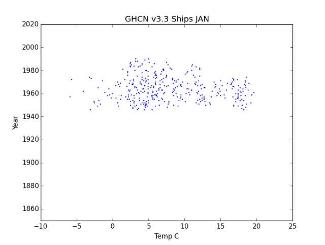
GHCN V3.3 Ships January
THE biggest thing is just that there isn’t much ship data and it doesn’t span much time at all. Roughly a bit over 20 years. So it will show up in the “Baseline” used by GHCN and Hadley, but will have no comparable data to compare to it. Whatever is compared will be from something else. Unless satellite data are added, that will be a land station on an island almost certainly at an airport now serviced by jet aircraft.

GHCN v3.3 Ships July
Note that the scale on the blue graph above starts at -10 C while this one starts at 5 C. I could fix all the scales at one wide width, but then it is harder to see the dispersion / changes as most temperatures would be in a tight band. This spreads the dots out more so you can see more detail. This matters more in the more dense graphs below.
Notice that nothing gets much above 25 C / 77 F. At about 84 F hurricanes / cyclones form and move massive amounts of heat to above the Troposphere. Ships also tend to stay away then and certainly don’t stop to take the temperature when the wind is kicking up and the waves turning to monsters.
I question what those ships were measuring when they measured something below 0 C. Perhaps ice breakers in the Arctic… So a small “dig here” for LAT/Long and such on those data points.
Since the overall lifetime of data is nearly nothing, it’s hard to say much about it other than that it isn’t here now so any Ship data is rather useless as a baseline and can only be compared to fabricated fantasy values.
Region 7 – Antarctica

GHCN v3.3 Antarctica January
In the region of the Baseline (1960 to 1990) there are a bunch of data between -20 C and -10 C yet nothing after that. Most likely some station was abandoned, or no longer reporting, or just dropped from the record. There are a couple of outlier data at about 5 C to 8 C which, given that ALL of Antarctica is ice, must be an error or measuring jet exhaust or near a building. (Or perhaps exposed to the direct sun, January being summer there). Other than those there is NO rise of the hot end above “just about 0 C”.

GHCN v3.3 Antarctica July
Again we see that the top end doesn’t move. Hanging around just about -3 C. Between 1960 to 1980 we have some “middling way cold” at about -40 to -30 that is missing in the data after 1990. A “step change” like that is NOT slow global warming, that’s instrument change.
Region 6 – Europe
My comments will become a bit more thin from here on down. Partly as the above graphs are most interesting. Partly as the things observed become repetitive. Top ends NOT moving steadily to the right. Loss of a “middle cool” chunk that is present in the Baseline and missing in the data after 1990. Not much in the way of “skew” of the mass of data.

GHCN v3.3 Europe January
Overall, a “scatter / gather” as thermometers show up, then suddenly get pruned about 1990, then an interesting drift of colder happening about -10 C after 2000 A.D. It looks like Europe had a few cold winters recently. Then any “warming” isn’t at the top end, it is from loss of cold data from the Baseline stations.

GHCN v3.3 Europe July
Here we DO start to see a bit of skew to the data. The top end does rise and the center of mass slowly drifts a bit right. But it happens in 2 steps. First as a step change in about 1950 as the Baseline stations got added, then after 1990 as station change continues. There is also a step change warmer on the low end with the thermometer changes of about 1990, but not much after that. I would suspect mostly Urban Heat Island effects as Europe is very densely populated.
Region 5 – Australia / Pacific Islands
This will include New Zealand and a bunch of islands scattered over the Pacific, but the mass of it will be Australian stations.
This first, January, graph has ONE dot about 1998 at -20 C that is certainly an error. I’ve left it in, even though is squashed the rest of the graph off to the left. Remember that, though blue, this is the summer season in Australia.

GHCN v3.3 Australia / Pacific January
Again a very clear lack of rise at the right hand side. Loss of stations about 1990 thins out data between 10C and 20C.

GHCN v3.3 Australia Pacific July
For the Australia winter, we can see a bit of bifurcation into those places that get cold in winter, and the tropical islands that don’t change. There are a few outlier high reports about 35 C about 2000+ that I can’t explain, but would bear investigating as likely errors, jet wash at the airports, or perhaps a time of still air and solar heated tarmac at the airports. Overall, there’s a pretty hard wall at 30 C or 86 F where Cyclones remove the heat.
There is a block of about 0 C to 10 C temperatures in the Baseline years that “goes away” when the thermometers are removed.
Region 4 – North America
Given the density of stations in North America, it is particularly interesting. Again we have a hard wall at the warmer right hand side, and drop out of middle cold stations from the baseline era.
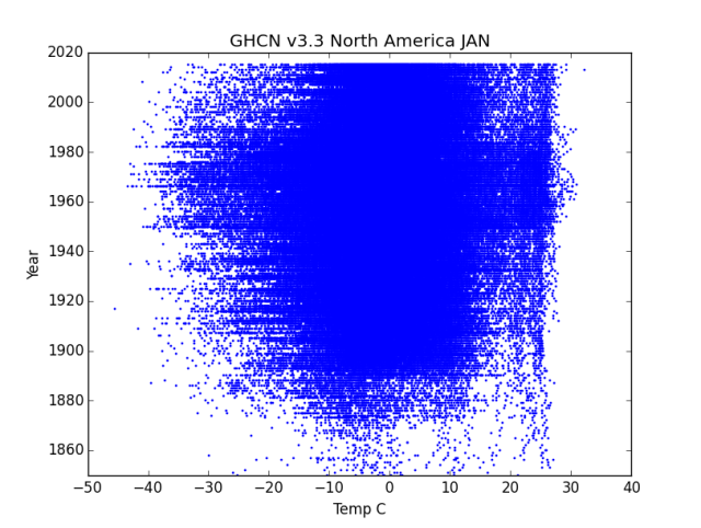
GHCN v3.3 North America January

GHCN v3.3 North America July
There’s a little bit of visible slew of the right side into the baseline era, then it just thins out into dots and loses pattern. The lower side (left side) has strong slew toward colder into the Baseline batch, Then it thins out as stations are lost, but also we pick up some cold outliers. Not sure how to interpret that.
Region 3 – South America
Again remember that a lot of South America is south of the equator and the rest is very near it, so while blue in color, this is the summer graph. There’s an interesting spreading out as thermometer counts rise to about 1950, then both the high end and low end narrow somewhat.
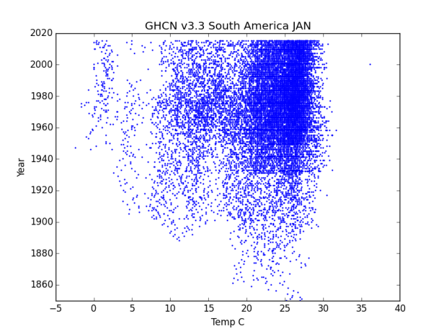
GHCN v3.3 South America January
Again the major feature is the loss of 0 C to 10 C range after about 1985.

GHCN v3.3 South America July
Again we see the fairly hard cap at about 30 C where water driven effects limit rise. There’s a general thinning after 1980, but it is more diffuse.
Region 2 – Asia
Absolutely straight sides on the right..

GHCN v3.3 Asia January
Thinning of the low end after the baseline thermometers are lost.

GHCN v3.3 Asia July
This one is interesting in that both the cold and the warm side show some spreading out but the cold side is getting colder faster! Then again we get a drop out in the -5 C to 5 C range post 1990 thermometer drops.
Region 1 – Africa
Strongly split between north of the Sahara and south of the Sahara and Equator, so we get bifurcated graphs. Has a few crazy outliers, but not much trend in any of it.
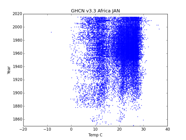
GHCN v3.3 Africa January
Thermometers come and thermometers go, but nothing of trend is visible. Clearly THE biggest thing in the data is Thermometer Change, not Climate Change.

GHCN v3.3 Africa July
There is an almost imperceptible slew of the right side adding about 1 C to 2 C of warmth (and a lot more thermometers) but at the same time the cold side gets about 10 C colder, then it has a spike down to -10 C to -20 C spots in the Baseline (wonder what station that was…) which then disappears again abut 1990, and in the late 90s we get a general thinning of the data below 20 C to date.
In Conclusion
So that is ALL the REAL data, from the unadjusted data set.
I’m not seeing the things you would expect from a general warming trend of the globe across all continents and seasons. It just is NOT showing hotter anywhere, really. At most, there is less extreme cold is some places; but most of it is from the step change loss of thermometers.
Given all the chaos in the data from instrument changes / thermometer loss, there is simply NO WAY to find a 1/2 C “warming signal” in that mess that has any validity at all. You are far far more likely to find artifacts of instrument change.
Here’s a sample of the code I ran. Each varies only on the “region=” number and the heading on the graph. Again, I’ve pretty printed the SQL statement, but it is all on one line in the actual code. Note that I’ve turned plt.xlim(xx,xx) into a comment so each graph just chooses its own range:
# -*- coding: utf-8 -*-
import datetime
import pandas as pd
import numpy as np
import matplotlib.pylab as plt
import math
import MySQLdb

plt.title("GHCN v3.3 Ships July")
plt.ylabel("Year")
plt.xlabel("Temp C")
#plt.xlim(0,40)
plt.ylim(1850,2020)

try:
    db=MySQLdb.connect("localhost","root","OpenUp!",'temps')
    cursor=db.cursor()


    sql="SELECT T.deg_c, T.year FROM invent3 AS I
    INNER JOIN temps3 as T on I.stationID=T.stationID
    WHERE T.region=8 AND T.deg_c>-90 AND T.deg_c<50
    AND T.month='JULY' ;"'

    print("stuffed SQL statement")
    cursor.execute(sql)
    print("Executed SQL")
    stn=cursor.fetchall()
    data = np.array(list(stn))
    print("Got data")
    xs = data.transpose()[0]   # or xs = data.T[0] or  xs = data[:,0]
    ys = data.transpose()[1]
    print("after the transpose")

    plt.scatter(xs,ys,s=1,color='red',alpha=1)
    plt.show()

    plt.title("GHCN v3.3 Ships JAN")
    plt.ylabel("Year")
    plt.xlabel("Temp C")
#    plt.xlim(-40,30)
    plt.ylim(1850,2020)


    sql="SELECT T.deg_c, T.year FROM invent3 AS I
    INNER JOIN temps3 as T on I.stationID=T.stationID
    WHERE T.region=8 AND T.deg_c>-90 AND T.deg_c<50
    AND T.month=' JAN' ;"
    print("stuffed SQL statement")
    cursor.execute(sql)
    print("Executed SQL")
    stn=cursor.fetchall()
    data = np.array(list(stn))
    print("Got data")
    xs = data.transpose()[0]   # or xs = data.T[0] or  xs = data[:,0]
    ys = data.transpose()[1]
    print("after the transpose")

    plt.scatter(xs,ys,s=1,color='blue',alpha=1)

    plt.show()

except:
    print "This is the exception branch"

finally:
    print "All Done"
    if db:
        db.close()

It might be interesting (and no, I don’t have chance of doing it even if I did program a python project in 1999 totalling probably six lines) to see the mean temp year by year in a different color on the same chart. You’d see kinks as the stations were junked, I reckon. And all the warming signal would be in those kinks.
On the European stations I expected to see more of an artifact from WWI and WWII, the sudden increase in density of measurements in Europe around 1950 is likely a post WWII result of rebuilding, but there does not seem to be a lot of station data drop out during the WWI years.
The feathering on the left (cold) side of the display seems to be more significant on the left cold edge of the display after 1990, so the station drops around that time have put a bias toward warm stations.
The patterns in both July and Jan for Asia is awfully interesting too after 1990, looks like a bunch of stations migrated from the mid temps toward the right to the hot side. Would the be due to massive urbanization and industrialization in Asia in the last 30 years or so?
Those patterns are very interesting, can you split them out by latitude to see if the shift to the hot side was due to more southerly stations being preserved than northerly stations when the drop outs started?
Thanks EM for making the effort! It’s a lot of work.
The Bureau of Meteorology (BOM) say they like to ignore any measurements from before 1910 because of a general lack of Stevenson screens prior to that time. It is tempting to believe that there may be other reasons – like it suits their (warmist) narrative to remove these records ;)
(See country vs city plots)
Here are some files in a shared folder (up to about 2010).
Melbourne and Sydney show warming (What a surprise! /sarc)
Country towns show little warming and sometimes cooling since mid 1800s
“Rural vs Urban Temperature Trends with links elsewhere-v2” has some nice URLs
There a couple of ‘explanations’ of homogenisation FYI.
https://drive.google.com/drive/folders/1z4R5c45mPLcS0czlJ5tU0VMy3szQIs7N?usp=sharing
@Larry:
The military are interested in weather, thus temperatures, and the war did not run over all European nations at the same time. I suspect a lot of it came out after the war, though.
FWIW, you see more WWII loss in places like the Pacific and other remote places. Thermometer goes off line as abandoned and only comes back with re-occupation.
Per “By Latitude” – Yes I can, but then you either get an explosion of graphs, or a mush of colors, or a multidimensional graph.
This is just the “starter set” in any case. The “Toss it up and see what needs more” start.
Clearly for S. America, Africa, and Australia / Pacific at a minium it needs division into equatorial, above, and below.
Then for places like Europe, I think a slice by “life of thermometer” would be interesting. And for North America, there’s just so much data it needs thinning into al ot of something, anything ;-)
@Rhoda:
Yes, it would… but I’ve paused the whole mean, mode, median thing until I’m less P.O’s at Python variation by versions… I’ll get back to it, but wanted a bit of progress behind me ;-)
@Sandy McC:
Thanks for the link. On my Someday Dream List is to gather data directly from the individual countries and bypass the NOAA / NASA / GHCN / Hadley gatekeepers… Someday…
Just in case you missed earlier missives, allow me to summarize this science yet again.
1) 288 K – 255 K = 33 C warmer with the atmosphere is rubbish. 288 K is a WAG pulled from WMO’s butt. NOAA/Trenberth use 289 K. The 255 K is a theoretical S-B temperature calculation for a 240 W/m^2 ToA (w/ atmosphere!!) ASR/OLR balance (1,368/4 *.7) based on a 30% albedo.
By definition no atmosphere includes no clouds, no water vapor, no oceans, no vegetation, no ice, no snow an albedo perhaps much like the moon’s 0.14. 70% of the lit side would always be above freezing, 100 % for weeks due to the seasonal tilt, not that it matters since there would be no water to freeze.
Without the atmosphere the earth will get 20% to 40% more kJ/h depending on its naked albedo. That means a solar wind 20 to 30 C hotter w/o an atmosphere not 33 C colder. The atmosphere is like that reflective panel behind a car’s windshield.
https://www.linkedin.com/feed/update/urn:li:activity:6473732020483743744
2) The 396 W/m^2 upwelling ideal BB LWIR that powers the RGHE is, as demonstrated by experiment, not possible. If this upwelling energy does not work – none of RGHE works.
https://principia-scientific.org/debunking-the-greenhouse-gas-theory-with-a-boiling-water-pot/
3) The 333 W/m^2 up/down/”back” GHG energy loop is thermodynamic nonsense, i.e. it’s calculated energy appearing out of nowhere, a 100% efficient perpetual energy loop, energy from cold to hot without work. (396 – 333 = 63) “net” radiation is thermodynamic nonsense.
https://www.linkedin.com/feed/update/urn:li:activity:6457980707988922368
4) 1) + 2) + 3) = 0 RGHE & 0 GHG warming & 0 man caused climate change.
I’ve got the science. If you have some anti-science, BRING IT!!
(If you don’t understand the acronyms maybe you should do the homework.)
Nick Schroeder, BSME CU ’78, CO PE 22774
P.S. According to NOAA the current rate of sea level rise is 3 mm/y. That’s not even a foot per century.
P.P.S. According to JAXA and DMI the sea ice and ice cap volumes have not deviated significantly from decades of natural variability.
P.P.P.S. Every year Greenland “loses” 400 to 500 Gt of ice/snow during the summer and gains it all back in the winter for a net zero change.
This is just a fantastic way to visualise information in a way that is rarely presented.
Thank you very much for running the extra analysis E M. Most intriguing.
Europe, Pacific, Australia, North America and Asia all have distinct reduction of stations in 1990. Africa is not very clear but it looks to me like a there is a small cull in the north in 1990, and another in the south around 2000.
If the station loss were a local phenomenon, would we not see a more gradual change as different nations changed their collection policies and practices? A generally uniform worldwide cut off suggests something happening at the GHCN (or Hadley) end.
There are earlier breaks in the data where the numbers of stations increases but these are at differing times. North and South America show this at about 1950, perhaps a bit earlier. Maybe this is the result of the growth of air transport after the Second World War? That said, if it was to do with airfield building, I would have thought the bulk of the growth would have been a few years earlier. Europe shows the effects of the war in the 1940s. Interestingly, I think the war shows up in the July tropical bit of the Australia Pacific records too.
I had a quick look at the GHCN site to see if there was anything accounting for the discontinuities but there was nothing obvious. A longer search may reveal something enlightening.
I agree with you that the changes to the data sets are a big problem. I don’t have the stats background to say for sure whether it is possible or not to pull a meaningful trend out of it, but I have my doubts!
Keep up the good work,
Keith
@KeefInLondon:
It was decisions on what is in vs out by the Temperature Gods at NOAA/NCDC/whatever they call themselves today. The folks in Turkey even complained about them only including warming stations in what they chose to take from the Turkey set and published saying if you use all the stations the warming goes away.
Back around 2010 to 2009 I did a posting on it, but a quick search didn’t pop the link… I’ll need to work on what I called it ;-0
I’ve seen similar things on some of the tropical Islands (again back about the 2009 work) where there would be 3 stations on an island but only the warming one was kept in after the baseline period.
IMHO, essentially, IF there is any way possible to bias the data, it IS being biased by using that way to do it. Everything from station selection to site changes to adjustments to … everything. So a local BOM (Bureau Of Meteorology) will report a lot of stations (and IF like Australia they are “on board” with the “movement” they will have cooked the data some already – IIRC New Zealand was caught out at that) then the NOAA folks pick and choose from that data to decide what goes into the GHCN. Then THEY make ‘adjustments” to it (that always only goes to making it warmer). Etc. etc.
Essentially, you will have more success looking at potential for Fraud than looking at physical realities when looking for why stations get dropped. That’s my opinion from looking at the data and reading a lot, anyway.
Then, with data this crappy, there isn’t much you can really say other than “It’s Crap”. I did my best shot at it with a method I called dT/dt and there’s a lot of stuff in that category:
https://chiefio.wordpress.com/category/dtdt/
My fundamental requirements were to ONLY compare a given thermometer to itself and to avoid any averaging if at all possible as “averages are used to hide things”. I found no warming.
OTOH, if you take a few thermometers that are individually NOT warming, and average them all together, you can get warming:
A bit tongue in cheek, but what it shows is that in a place that had THE hottest heat wave ever, if you take the thermometers in GHCN and average them together, you get a graph with rising temperatures… so while never being hotter than The Record, it is “warming” as far as GHCN is concerned…
In short, GHCN as a data set is a fraud and the whole “need to regulate CO2” is a scam; everything I’ve been able to find points that way.
Hummm, one wonders how the GHCN compares to the USHCN data? Is it the same?
https://www.ncdc.noaa.gov/data-access/land-based-station-data/land-based-datasets/us-historical-climatology-network-ushcn
USHCN, as the name United States Historical Climate Network states, is only in the USA.
GHCN as the Global Historical Climate Network, covers the globe.
USHCN has a lot more stations, but only covers our little patch of dirt.
Essentially a sub set of USHCN goes into GHCN as the USA component. Similar subsets from all the various National BOMs get gathered together to make the GHCN.
That a station disappears from the GHCN does not necessarily mean it stopped existing and recording; it mostly just means that TPTB decided to leave it out…
@Larry L:
Per the “by latitude” thing: In South America, in an earlier exploration of the data, what I found was not a latitude issue but an Altitude issue. Things up in the mountains going away, leaving only stuff down where it is warm and stable.
To some extent, what I’m doing now is a “do over” of that prior work, but with graphs instead of boring tables and with newer data sets:
Then further down:
And Argentina:
Now that was 2009, and v3.3 is up to 2015. No idea what I’ll find in v4 now.
But the overall pattern is Very Clear. Have high volatility stations in cold places in the Baseline so you can print their cold excursions. Remove them from the present and use thermometers in places that don’t change much, then Fabricate some fantasy temperature from your low volatility low range place to compare with the present in the high volatility cold place..
So “by latitude” is interesting, but I think the real Magic Sauce is in the hills and mountains…
E.M., I recall a post you did around 2009-2010 about the disappearing thermometers at altitude. Unless I’m confusing it with another post, I believe you titled it “March of the Langoliers.”
Then again my steel trap mind might be a little rusty.
GRrrrrump!
So I’m using MySQLdb to get into the SQL database… but it is only in Python 2.x releases. So I’m looking at how to use an SQL interface to Python 3.x releases… Why? Because I keep trying to do things (from models / tutorials) that I find out don’t work in 2.x Python.
https://www.tutorialspoint.com/python3/python_database_access.htm
See, MySQLdb doesn’t work in 3.x and they are going to use something New! Different! instead.
OK… so I’ll just install that too…
https://packages.debian.org/jessie-backports/python3-pymysql
OK, I can do an install of python3.pymysql…
Not there yet on Arm…
OK, off to do “Go FISH!” on other SQL database interfaces that might actually exist…
It is a rather crazy language where core functions show up “whenever” even sometimes a few years after the release level changes…
@HR:
Maybe one of those?
Yup. doze wuz dem.
I was off looking for them when you posted the excerpts above regarding the dropping of thermometers up in the mountains.
We’re crawling on the broken glass of all the thermometers that have been dropped.😜
Well, it looks like there is an “sqlite” that only serves to localhost that has a connector. So I’ve installed it and it looks like it is there. So I may end up doing a minor swap of database system:
So maybe I can get SQL and Python3 that way… We’ll see as I go through all the other libraries that contain important things I want to use and find out if they are there for sqlite…
So, to recap:
There are 2 ages of SQL Server (2.x and 3.x) that are not compatible and where various libraries that you need to do things might or might not exist. Then, there is a 3rd version, sqlite, that doesn’t serve anyone but your own workstation and has a different set of libraries and such that is ported and working with it. So you have a 3 x on releases and maybe a 4x as sqlite3 exists so sqlite may also exist. Then a similar multiplier on Libraries and then ?x on “other stuff”… So you get to sort through all that stuff to find a set of “mix and match” that works. OK, Got It.
Thanks for all this unpaid dedicated work analysing what has been happening & not happening, with global temperature recordings.
Bill
@Bill In Oz:
You are most welcome. It’s a fault of mine. I just can’t let a Stupid Assertion gain traction without saying (politely…): “Um, excuse me, but you do know that’s completely wrong for these reasons: A,B.C.C.E.F.G….”
Fully saturated saline water freezes at 0F (by definition, at standard atmospheric pressure), so I would expect ships to find water colder than 0C at times and definitely find air below 0C at times; even in sub-Arctic areas.
Pingback: GHCN v3.3 Regions Closeup Current vs Baseline | Musings from the Chiefio
An item that links back to Joanne Nova’s page, and how the Australian temperature record and how it is being manipulated by adjusting upward old temperature records
https://www.powerlineblog.com/archives/2019/02/the-greatest-scandal-in-the-history-of-science.php
Pingback: GHCN v3.3 vs v4 – Top Level Entry Point | Musings from the Chiefio