
I’ve mentioned a few times that the loss of thermometers after the “Baseline” period seemed to preferentially lose those in High Cold Places. Well, thought I, I think I can now graph that… So I did.
One thing I noticed was that the graphs strongly reflected the Hadley choice of baseline, extending to 1990. I thought of doing them all over again, but kind of like the way there’s a distinct slice of “Hadley Special” next to the blue NASA GIS baseline… (You’ll see what I mean).
Initially this was a challenge to do as there were some “limits on number or records that can be graphed being blown” and I was getting error branches without explanation. Adding “DISTINCT” to the stn_elev fixed that (and gave me what I really wanted anyway:
Is there a station at that altitude, or not?
IF 2 or more stations share exactly the same altitude, they will only show up as one dot, but that ought to be rare.
I also ran into some stations at -1000 meters elevation or so. WH? Turns out they are “missing data” flagged at -999 m (I’ll put a table at the end listing them).
First up will be a purple graph of All Stations. I start this in 1800 instead of 1850 (actual data goes back into the 1700s but it’s useless as there’s almost no thermometers). This lets you see the ramp up to “usable numbers” in 1850+ a bit better. I mostly left the altitude / years limits the same so the graphs can be directly compared, but Alldata, Asia, South America, and North America needed 5000 M limits (the rest are 4000 meters).
Change of Altitude over Years
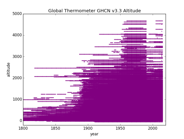
GHCN v3.3 Distinct Altitude locations over years
Nice Big Fat lump of stations at altitudes above 2000 Meters in the baseline period. GIS temp starts in 1950 to 1980, Hadley runs 1960 to 1990. It looks like about 1950 to 1990 is at high altitude, the better to accommodate both I guess. Then the altitudes start to thin and things run off to the beaches and lower elevations.
Given the recent discussions of how temperature is a function of pressure / altitude:
“I think this matters”…
I’m now going to do the Regions (continents). Again, minus Region 8: as first off there’s no data outside the baseline and second off, no altitude data in those records (sea level being presumed?) or missing data flags of -999 m.
Region 1 – Africa

Altitude by Years Region 1 Africa GHCN v3.3
Africa is a lot shorter than I’d expected. Nothing over 2500 meters. I don’t see any obvious special treatment of the Baseline for altitude. Perhaps the changes in Africa are more “by latitude” (since we saw that in the area graph…)
Region 2 – Asia

Altitude by Years Asia Region 2 GHCN v3.3
In this one you can very clearly see the Hadley Basline where those stations at altitude have a ‘red tag’ on the side extending from the GIStemp baseline end of 1980 out to the Hadley baseline end of 1990. Then Oh Boy do they prune those mountains out of the data! Everything over about 1750 M getting thinned and stuff over about 2250 M getting massacred.
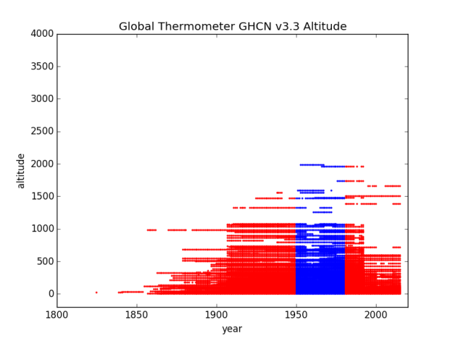
Region 3 – South America

Altitude by Years South America Region 3 GHCN v3.3
This one is a little different. We don’t lose so many very high altitude, mostly losing stations in that 1200 M to 2200 M band, BUT, look at the additions down low in the 200 M to 1000 M band. Loading up with lower altitude ought to be as effective as reducing high altitude. Then, those 1-2kM stations will be “infilled” with hypotheticals from down in the more tropical and coastal areas. Nice trick!
Region 4 – North America

Altitude by Years North America Region 4 GHCN v3.3
This was one where the volume of data was causing me grief. It still has the bottom of the graph very solidly colored. This likely needs breaking out by sub-regions to get a better visualization of the loss. It is still clear that “At Altitude” gets dropped just after the Baseline period, though they were nice enough to hold those top ones into the Hadley baseline (that red tag on the side of the blue).
Region 5 – Australia / Pacific
Altitude by Years Region 5 Australia / Pacific GHCN v3.3
Still a couple of stations at altitude (maybe in New Zealand?) but the rest pretty much toast. Huge bite out of the 750 m to 1250 m range. That sounds like Australian mountains to me.
Region 6 – Europe

Altitude by Year Region 6 Europe GHCN v3.3
A very distinct offset in the European data to the “Kept In The Baseline” being aligned with Hadley 1960-1990. Just after that the “High Cold Places” get heavily thinned.
Region 7 – Antarctica

Altitude by Years Region 7 Antarctica GHCN v3.3
Well, at least they kept one high altitude station. Probably a big name one so deleting it would cause notice…
In Conclusion
Here’s the report of stations where there is a -999 missing data flag:
mysql> SELECT name, stn_elev, stationID FROM invent3 WHERE stn_elev
You would think, what with Google and all, they could look up the altitudes, but “whatever”. I note that 4 Antarctic stations made the list.
Here’s one example of the program. I didn’t save every copy this time as they differ only in the setting of the Region number:
# -*- coding: utf-8 -*-
import datetime
import pandas as pd
import numpy as np
import matplotlib.pylab as plt
import math
import MySQLdb

plt.title("Global Thermometer GHCN v3.3 Altitude")
plt.xlabel("year")
plt.ylabel("altitude")
plt.ylim(-200,5000)
plt.xlim(1800,2020)

try:
    db=MySQLdb.connect("localhost","root","OpenUp!",'temps')
    cursor=db.cursor()

    sql="SELECT DISTINCT I.stn_elev, T.year
    FROM invent3 AS I INNER JOIN temps3 as T
    ON I.stationID=T.stationID WHERE I.stn_elev>-100"

    cursor.execute(sql)
    stn=cursor.fetchall()
    data = np.array(list(stn))
    xs = data.transpose()[0]   # or xs = data.T[0] or  xs = data[:,0]
    ys = data.transpose()[1]

    plt.scatter(ys,xs,s=2,color='purple',alpha=1)

    plt.show()

    plt.title("Global Thermometer GHCN v3.3 Altitude")
    plt.xlabel("year")
    plt.ylabel("altitude")
    plt.ylim(-200,4000)
    plt.xlim(1800,2020)

    sql="SELECT DISTINCT I.stn_elev, T.year
    FROM invent3 AS I INNER JOIN temps3 as T
    ON I.stationID=T.stationID WHERE T.region='3'
    AND I.stn_elev>-100 AND  year>1949
    AND year<1981 AND I.stationID NOT IN
    (SELECT I.stationID FROM invent3 AS I
    INNER JOIN temps3 AS T ON I.stationID=T.stationID
    WHERE year=2015);"

    cursor.execute(sql)
    stn=cursor.fetchall()
    data = np.array(list(stn))
    xs = data.transpose()[0]   # or xs = data.T[0] or  xs = data[:,0]
    ys = data.transpose()[1]

    plt.scatter(ys,xs,s=2,color='blue')
#    plt.show()

    sql="SELECT DISTINCT I.stn_elev, T.year
    FROM invent3 AS I INNER JOIN temps3 AS T
    ON I.stationID=T.stationID WHERE T.region='3'
    AND I.stn_elev>-100 AND (year>1980 OR year<1950);"

    cursor.execute(sql)
    stn=cursor.fetchall()
    data = np.array(list(stn))
    xs = data.transpose()[0]   # or xs = data.T[0] or  xs = data[:,0]
    ys = data.transpose()[1]

    plt.scatter(ys,xs,s=2,color='red',alpha=1)

    plt.show()

except:
    print "This is the exception branch"

finally:
    print "All Done"
    if db:
        db.close()
After the first run I commented out the purple graph as I didn’t need to keep making it ;-)
I’m pretty sure this code is right, but it was a bit tricky to get past various odd errors, so I might have missed a trick in the disruption.

A suspicious mind suggests that high stations are more prone to cold excursions than to hot. Am I right?
Do the climate scientists run a special secret course in how to arrange things ? That what it looks like. All those high altitude stations being dropped out of the weather record almost across the globe !
How can this not impact on any record of global temperatures ?
Once again thanks Cheifio !
Do the climate scientists run a special secret course in how to arrange things ?
I think it more likely that they use a lot of super computer time, answering the following question:
What happens if I do this?
Oh good the average changes.
Is the change in the preferred direction
No = do over with different options
Yes = add to adjustments used
I think what we are seeing is 1000 people making 1000+ small tweaks which each move the average in the direction they want. Almost impossible to document, since the abhor telling us exactly what they changed and why they just make unexplained poorly documented adjustments to “fix errors” yet we know by examination that trivial errors like the -999 codes could very easily be corrected or dropped but are left in the data set.
@Larry:
IMHO the Baseline is not one of those incremental things. (Yes, I think there are lot of them…). Looking at the Baseline Stations, they did not just suddenly go out of existence. Most of them are still alive and producing data (that Turkey complaint about GHCN ignoring most of their data, plus the USHCN for the USA).
No, that hard cutoff at 1990 is directly tied to ONE decision so all happens everywhere at the same time. There is a meeting ever decade or so where the Key Players all get together and decide how to manicure the dataset for the next version. That point it time is when v1 becomes v2 becomes v3 becomes v4. Some of the incremental stuff shows up in the minor numbers (v3.0 v3.1 v3.2 v3.3) that change every few years…
Yes the actual execution, but the discovery process of how to cook the books, I think has lots and lots of finger prints on it. Someone finds a nifty way to skew the data that is hard for outsiders to notice or document, then they come up with a logical sounding basis for doing it under color of solving some other problem etc.
Some of it might be accidental in the sense that they make corrections without really realizing the down stream consequences. Those that push the numbers in the wrong direction get noticed and backed out as faulty, but those that push the numbers in the right direction are just accepted at face value and never audited.
If they properly documented changes and announced when a specific data tweak was put in place outsiders could do that auditing and keep them honest but they have absolutely no reason to encourage examination of their data and methods because they know how sloppy and impossible to defend their work is. Any profit making corporation who treated important company data like they do the climate data, would have been shut down by auditors 40 years ago.
How many ground stations are enough? Would one station get the job done? Most people would think that ground stations should be distributed evenly across the entire globe. Instead the coverage is very uneven and here are a few of the problems.
1. Given that more than 70% of the planet is covered by water why are there so few ground stations in the oceans?
2. Why are the number of stations at high latitude declining?
3. Why are there so few stations at high altitude?
4. Why are stations subject to UHI (Urban Heat Island Effect) not eliminated?
5. Why did the number of stations take a sudden dive in 1975?
I could go on but you get the point. There was a sudden dramatic drop in the number of stations included in the GHCN so I visited NOAA in Asheville to find out why. I did not get a satisfactory answer but Anthony Watts is to be commended for chewing on this bone.
Given the fudging of data at NOAA (GHCN) and NASA (GISS) that has been abundantly documented these organizations should be de-funded. The public is better served by satellite measurements by UAH and RSS. Funding junk science undermines the public’s trust in real science. Dwight Eisenhower warned us about this:
https://en.wikipedia.org/wiki/Eisenhower%27s_farewell_address
@Rhoda Klapp:
Yes, you are right.
a) At altitude there is less air to prevent heat loss.
b) At altitude there is less potential for clouds over head (i.e. cloud deck at 1000 M means nothing to a 2000 M station…) and less water vapor over head to reduce solar gain / slow radiative losses.
c) What is snow on the mountain becomes rain as it falls through the warmer lower levels of air.
d) Lest mas of air per M^3 means faster temperature rise per unit solar heating.
e) At altitude is just colder, and cold excursions can go further, faster, that warm ones.
f) More influence from high air flows (jet stream et. al) especially at higher latitudes. In winter, at the poles, the stratospheric altitude can intersect ground level – this is worse up the mountains…
It is my most benign thesis (i.e. the one where I don’t accuse the “climate scientists” of being deliberately in league with the Devil and bought off by Soros NGOs…) that it is this increase in temperature volatility in cold and high places that is causal when mixed with The Reference Station Method and that the 1/2 C of “warming” is an artifact of that process operating on averages of daily data.
Essentially you lock in some really really cold excursions in the baseline, then you can never get back to them in the fabricated comparison value as it is made of averages (that flatten volatility) and based on places that do not move as far.
You claim it drops 4 C but really it drops 5 C during a cold plunge, but now your “data” doesn’t show that extra 1C of cold. So right now it’s freeze your buns off cold in the mountains. Temps will be spiking way low. But the fabricated value will not go far enough as they apply a linear relationship set during a different time.
FWIW, there is also the way their QA process works. I actually read the code for this one. They look for outlier values to toss BUT use the same yardstick each side, up or down. This will toss more valid low excursions than hot as the volatility profile is different.
My less generous belief is just that they are bought off and do what their masters ask…
The reality is likely a mix of Corrupt Leadership by some, a gaggle of Useful Idiots at the bottom, and some “go along to get along” middling folks who know it’s wrong but do as they are told, with some who just believe the bull shit and are not sharp enough to see it for what it is.
@G.C.:
IMHO it isn’t a question of how many, but how good and what you do with them.
They have lots of crappy stations and do stupid things with them, so their “temperature” is useless.
FWIW, I think you could do OK with about 100 globally. The only problem is they must be put in place 200 years ago and then not changed or moved or have their environs change for 200 years while being studiously read and recorded the same way at the same time every single day.
Instead we have a constantly changing kaleidoscope of instruments of different technical types and abilities installed at different times and places, read differently by different folks in different scales and calibrations and then moved, fiddled with, and replaced from time to time. It is simply not possible to do calorimetry with that mess.
The technical stuff here is way over my level of competence. :-(
But this is an important discussion. I agree completely with Cheifio’s analysis of why it is not exactly a plot..It is just a major inter continental stuff up !
I recall seeing here – although I can’t find it now – that the numbers of filled-in temperature boxes is actually far greater than the number of boxes with actual records. That leads to some thermometers having a far higher effect than others. You don’t get a meaningful average that way. Of course it’s not a meaningful figure anyway but it really doesn’t even try. What I’d like to see is long records expressed as a temp vs time graph, then classified in terms of rising, falling, flat, humped or troughted and the numbers of each produced. Say we had none cooling and 1000 warming, that would mean something. If they were more evenly distributed between categories it would mean nothing much was going on.
(This is not a hint that I want anyone here to do that work but maybe think about how it might be done to produce a better indication of warming than the useless global mean)
@Rhoda – That’s a very good idea for talking about a “global climate.”
The global climate, IMO, is writ large with the glacials and interglacials as global weather and the ice age we are in (permanent ice at both poles) being the current actual global climate.
In practical geographic terms, the Koppen climte classification system is what is useful for humans. That’s where temperature is most likely going to come into play. For example, if you live in a temperate, semi-arid zone, long-term rising or falling temperatures may bump you into or out of the semi-arid category into fully arid zone. The flora and fauna will also change accordingly. Add in the recordings of rainfall and you probably have useful information.
Going back to your suggestion, if you had a decent handful of thermometers and rain gauges in each climate zone, then you could discuss the sum of the zones going in each direction. Reports such as “We have 33 zone going Warmer-Drier, 16 zones going Warmer Wetter, 58 zone showing no change,” would tell us something useful about our planet.
The arguments about whether or not the Medieval Warm period was global is classic. The warmers claim that the warming was regional, not global, and there were many areas that remained cold or were colder. Under your system, if say 250 zones were being monitored and it is found that 200 are warming, 25 are cooler, and 25 have remained the same, well then we’ve got useful information on global climate that you can wrap your head around and make some sense of what’s going on with the Earth.
Anyhow, your suggestion is too useful and practical to be adopted by those who are committed to putting out one grand average number for the temperature of the Earth, and whose salaries depend on studying the entrails of that number in order to proclaim, “WE’RE ALL GONNA DIIIIIEEE!!!! Please send more money.”
I’ll add: a Global Average Temperature = “Look! Squirrel!”
Even if the readings at altitude had been kept, it’s still wouldn’t tell us much. Temperature alone isn’t climate.
It’s all to fool the rubes.
Pingback: GHCN v3.3 Stations By Altitude By Years (or “Mountains? What Mountains?”) – Climate Collections
Rhoda,
There a few over 2500 active thermometers at thr current end of GHCN.
GIStemp uses 16,000 “Grid Boxes” to compute “Global Temperature” (sic).
2500/16000 have a thermometer.
13500/16000 do not.
As peak thermometers was about 7000:
9000/16000 have NEVER hed a temperature recorded by a thermometer.
FWIW, I set out to do something like that in the Dt/dt series. I look at it by month. One of the big things I found was that even for single sites, some months would be warming while others did nothing or cooled. That is not a constant well mixed gas causing generalized warming, that’s weather pattern changing. I called these “all the months” graphs “Hair Graphs” (and that term in the search box to the right ought to pull them up).
I also did a Dt/dt calculation for regions, countries, and the whole works. Didn’t find warming.
The basic thesis was to just start in the present (supposedly the best thermometers we have) and for each thermometer compare it only to itself for each month back in time. The far past would slowly become more volatile and a bit of a mess (as you get back to the 1700s and only one thermometer…) but with a mid 1800’s cut off it was pretty clear. Nothing much happening.
ALL the “warming” is in the “adjustments” and in “The Reference Station Method” of making up non-existent grid-cell “temperatures”.
I’ve been thinking of redoing dT/dt using GHCN v4 and a database (which was the reason I got started on all this SQL / Python stuff…) but with a few changes. In particular, I used the “first differences” method and some folks didn’t like that (so for my v1 vs v3 comparison I re-did it using a baseline method and it wasn’t much different at all…); so what I thought I would do is compute an average of {all readings across years for a thermometer in a given month} then use that as a baseline ONLY FOR THAT MONTH. This gives you 12 slopes for the ‘anomalies’ for the 12 months of each thermometer. Now, for each thermometer, you can find out the status of EACH MONTH and you can decide if that thermometer is, overall, warming or not. THEN, and only then, you can count up the warming vs not thermometers.
At no time is a fictional estimated temperature used.
At no time is one thermometer compared to another.
At no time is one place compared to another.
I think it would work rather well.
Just a small matter of programming and time…
Personally I think the best method of measuring the earths long term temperature trend would be to use the earth itself as the integrating system via long term soil temperature records at a specified depth with a specified surface cover and soil type. The only minor problem is it would take a couple centuries to gather a useful data file to work with
https://www.builditsolar.com/Projects/Cooling/EarthTemperatures.htm
https://www.weather.gov/ncrfc/LMI_SoilTemperatureDepthMaps
E. M.,
In your 8:44 reply the desired word “cloud” has become ‘could’ — cloud deck
Lots of snow stories on KOMO News Seattle.
@J.F.H: Fixed it. Thanks.
Is it possible to identify and see the trend in only the dropped stations?
Oh MR Smith how can I nominate you for a Nobel prize?
If there was any justice in the world, the two given to your ex irish president O’ Bama and the goricle should be rescinded and given to you and Anthony Watts.
Of course the global temperatures are a load of ‘jobbies’ (Scots for faeces) and the very idea of a world temperature is ridiculous.
Just what is the goldilocks temp anyway?
@EM: Was there a trimming of high LATITUDE as well?
@David A:
The problem with the dropped stations is that they are dropped in the GHCN input so not available in the GHCN. You would need to go upstream to the various BOMs of the world to get the full data. Knowing that’s a huge chunk of work and many nations sell their data so won’t just hand it over, NASA / NOAA / NCDC / NCEI {whatever they are these days] love to tell you to “go fish” there.
@Patrick Healy:
Thanks for the Kudos, but I’d be just as happy with a management role over the folks creating GHCN / USHCN ;-)
@Steven Fraser:
See the graphs here:
You can see where the blue exists vs red now. IMHO it varies by continent. Canada and Australia clearly have a “Latitude issue” and maybe Russia too. Africa is a huge one, with the south fading away and the thermometers clustered near The Sahara kept.
So IMHO, yes, both the by Latitude and by Altitude “tricks” are used, just in different places. Africa was too short to use Altitude effectively, so… ;-)
There’s also “nearness to water” on my “someday” list to explore, but not today…
You don’t find that many Heat Islands like fast expanding towns/cities and Airports at High Altitude, maybe that has something to do with the choice as well.
@A.C.Osborn:
Most people want to live near water / coastline, so yes, absolutely, to get the most UHI you go to major cities near sea level.
I noted that for California we had 4 surviving thermometers, all near the beach… in major population areas often with massive growth. Los Angeles, San Francisco, Santa Maria (coastal just north of L.A.) and one other I don’t remember right now. Nothing up in the snow covered Sierra Nevada or Cascades. .. Now I personally have been on the beach swimming one week then skiing the next weekend. To claim you can accurately recreate Tahoe temperatures from a thermometer at SFO is crazy talk. (SFO Airport can vary 50 F in the summer just based on what the fog does that day… then Tahoe can swing a dozen+ degrees based on snowing or not while SFO doesn’t change (clouds/fog over SFO while snow depends on wind and ridge lift plus % water in the clouds)
Heck, I’ve driven from San Jose about 50 miles to SFO and had it be 50-something F both times, but one had San Jose at 50-something and the other was 104 F in San Jose. Just depends on the fog vs sun. Inland heat causes air to rise and pull a cold fog blanket over San Feancisco… while inland cold can have both cold. You can’t even predict 60 miles away from SFO temperatures.
EM,
it’s great to see you are tackling this. I’ve long thought your take on it would be different and valuable. I’ll still need to read your posts again thoroughly.
We agreed a long time back that altitude matters. Despite all the crowing about how anomalies do away with the issue of actual temperature, they don’t entirely. I gave an example (Reno vs SFO, vs Sacramento) here: https://diggingintheclay.wordpress.com/2012/10/21/the-trouble-with-anomalies-part-1/ It is noticeable that high altitudes and latitudes produce greater extremes. As you commented, “water matters”.
I tried to extrapolate to the bigger picture here: https://diggingintheclay.wordpress.com/2012/10/29/the-trouble-with-anomalies-part-2/ but my analysis was limited by working in spreadsheets. Also, weather extremes matter: https://diggingintheclay.wordpress.com/2013/04/01/weather-swings-and-see-saws/ Currently we have low sun activity, in which the jet stream (in N) moves south and becomes more twisty. In the last few weeks UK has had Arctic cold and now balmy winds from the south.
If you have weather stations in areas more susceptible to extremes in one period, and those in stable, less variable areas in other periods, you are not comparing like with like. And if one period is cooling (more cold extremes?) and the other is warming (more stability), then which weather station is where and WHEN matters.
@Verity:
All the codes I’m writing and the database stuff will all work on a PC too. I’ve also put up an article about running Linux in a “Docker” on a Windows box (takes about a minute to install) so you can get any and all of this running on your PC very quickly, should you wish to do so.
If you chose to, let me know. I’ll fire up my old PC and script out the process, if needed.
FWIW, most of my “problems” with Python 3 vs 2 would be gone in that case. The “missing bits” are present on Intel ports, just not on the Arm chip yet…
Using Docker, a video:
Here’s where I started my wandering into Python and MySQL and such:
Good for a laugh as you can follow my history as I “ran into walls” and found what works ;-)
SQL is fairly trivial to learn. Python is OK, but a bit of a PITA with multiple versions and incompatible ways of doing things between them, but if you stick with 3.x it would be much easier. I’m using 2.x as the MySQL database connector isn’t ported to 3.x on Arm chips yet. On a PC that would not be a problem.
I’ll “hit the links” to your stuff sometime this afternoon.
FWIW, in this one:
there is a step change to warmer that happens right when the Jet Age arrived at the airport… I suspect that generalizes globally… So checking all the A stations (airstation flag) across months (to find their low wind months…) likely would be productive.
Related?
@EM, I was particularly struck by your GHCN v3.3 San Francisco July graph
@ossqss, thanks – looks worth reading
@Verity:
Yeah, I’ve got the idea of searching for similar step change Airstations… but need an automated way to search 7000 stations… So some way to find discontinuities in the mean… I just wish I’d been awake enough to have picked it out (though I’m happy it was pointed out to me…)
Using SQL has been a decent gain, and learning SQL nearly trivial. I deliberately wanted to get some Python experience. In general, it has been a pain. It would likely be better to use R or for tech folks who like leading edge stuff, Julia.
I’m still doing a fair amount of prototyping when I expected to be done building now. Largely due to what is or isn’t ported to the Pi Arm class of machine. Using an Intel based machine would be easier to build. FWIW, there is an SQLite version I’ve installed and will test as time allows. A first cut at it was unimpressive, but we’ll see…
What surprised me was how easy and effective it is to toss together a new DB layout and reload the data for a particular use. Like tossing in cos (latitude). Actually easier and faster than doing it in a program at the other end. That has changed how I think about solving things. So I’ve got a table schema with things like mean, mode, range, first year, last year, etc. Later this week I hope to get the programming done to populate it. Then a load of stats tests become a simple report query.
Usually a DB is considered a durable sacred thing, not a disposable transition state; yet it can be effective as both. So I’m thinking about where best to calculate those things. During the FORTRAN load step? Using SQL statements in the DBMS? Using some other language on the DB content (like Python sql interface / stats packages)? I’d just be using Python, but version 2 on the Arm chip has a working mySQL interface but not the stats pack, while version 3 has the stats but no mySQL connector.
There are a few connectors, so searching them may fix it. Then SQLite is v3 I think, so if it has a working connector it might work. (it is this searching 3 x 2 x 2 mix and match stuff that is pain. On Intel chips this would not exist as it gets ports done faster and complete. Eventually this will change as Arm adoption goes up… but not yet). It is remotely possible some other distro might be working, so I may try a systemD infested version like Centos.
Normalization isn’t just a fuddy-duddy mantra. Normalized tables are easier to augment with new fields and other tables.
Normalization gives the best average performance for unknown future uses. Structured data can be customized for superior performance on known uses. In between lie various degrees of Data Warehouse…. Excess redundancy complicates updates, but can make reporting faster or easier.
Normalizing is not the only choice, just the best one for average uses absent other considerations.
One example: If you have a file of time cards in sorted order, applying it to a personnel file similarly sorted to produce checks in the same order will be most efficient. One pass of each file, no head seeks it they are on different spindles. ISAM still is in use for that reason. IIRC mySQL has an ISAM engine available.
Unfortunately, such exceptions are relatively unusual. Absent such an identified reason, normalizing is the best choice.
In my case, I realized I was computing cos (latitude) for each map. Better to compute it once and store in the DB for each station. Similarly a bunch of other stats can be computed once for each instrument, or data series. Things like % missing by month per instrument, or first and last year per instrument, or mode, mean, median by month per instrument.
I’d rather use a hierarchical DB that included joins and such (“relatioal features” ) as there is a clear structure here. But flat tables is good enough.
The RAMIS II and Focus products I used were like that. You could do flat tables, hierarchical, or indexed sequential as needed. I really liked them :-) Also had facilities to connect to other file types, so data like the GHCN files only needed a description of the data layout. Basically, one line and you could read it in. MySQL is a toy in comparison, but good enough.
Apparently MySQL doesn’t offer functional indices. For example, you could create an index based on cos(latitude) and use it in a join. SQL Server has functional indices. SQL Server Express is free, but you probably don’t want to go there.
I also found out that MySQL is being replaced with MariaDB as of the most recent Debian / Ubuntu, so likely there will be less effort to make sure all the “bits” work on it. I may need to just swap to MariaDB to get the recent ported stuff. (MariaDB is essentially MySQL without the Corporate Ownership – written by the same guy.)
So it’s looking like:
Try MariaDB connector with Python3.
Try Postgresql with Python3.
Try “other connectors” for MySQL with Python3.
One of those ought to let me use Python3 with some SQL database. Maybe ;-)
But the reality is that the users of databases are generally on Big Iron, so the notion of using it on a dinky Arm SBC is near zero (in their opinion) so little effort goes into the Arm port bits. End of the list, really.
Climate related study again on Greenland temperatures during the viking occupation period.
https://phys.org/news/2019-02-vikings-warmer-greenland.html
It again shows an anomalous warm period.
Pingback: GHCN v3.3 vs v4 – Top Level Entry Point | Musings from the Chiefio